bermuda wasn’t built in a day
Two months and 132 commits later, bermuda is done.
What is bermuda? You’re looking at it. If you’re reading this block of text in your inbox or a feed reader, stroll on over to my blog and you can see the new theme I’ve built.
It took me two months, and I can’t remember exactly what made me finally get to work on a new design. The previous glorious red and orange one was live for seventeen months. I suppose I was getting sick of it, and things started to fall out of place or feel a bit incomplete. The world of web design and development is always changing, so I felt there were a few things that were getting a little bit outdated.
Originally, bermuda was just going to be like this:
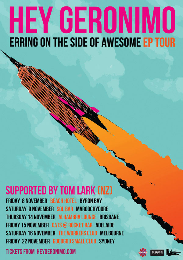
Just a refreshed, updated stylesheet with some new colours and borders, and everything else pretty similar. It’s no surprise that bermuda was inspired by the following Hey Geronimo poster which also sits on my bedroom wall. My previous design was in fact inspired by an older Hey Geronimo poster.
I don’t think I need to mention for the thousandth time that Hey Geronimo is my favourite band. Also, bermuda was named after a Hey Geronimo song that hasn’t been released yet, but I’ve seen them play enough times to know the song.
I decided I didn’t want to simply re-do the stylesheet. I wanted to do everything over from scratch. bermuda is my first project on GitHub. I have used GitHub before, but never for personal projects.
The first thing I did was rebuild the HTML and all my WordPress theme files from scratch, with a complete focus on structure. I had a really radical idea to have blog posts set out like postcards, with text on the left hand side and post metadata on the right, and individual posts set out like a letter with a letterhead. I soon realised this was far too difficult, especially if I was considering a mobile-first approach and wanted a responsive design. It was too complex.
Colours
The colours actually came last, even though they were in my mind visually. It was difficult trying to get a lot of shades of blue and teal. I also avoided using more than two main colours from the advice of a designer at work, so the orange I was originally going to include didn’t make it. Also, there’s only one shade of pink!
I think the main blue background may still be a little bright. I had to tweak it a little bit because on some monitors the text in the sidebar is hard to read. But I am absolutely in love with this blue.
Fonts
I wanted to use exactly the same font on the poster (League Gothic) but it was not going to look very nice as headline text if it was going to be in uppercase many times throughout a page (particularly the homepage). I was going to go for something fancier or at least one other font for headings, but decided to try just one font across the whole website.
I used Source Sans Pro, as I had on my previous design, but made the font thinner. James pointed out that it was incredibly hard to read on his Windows machine, which prompted me to select Roboto, the font I use on my portfolio.
The cute rounded font Karla came up as a second option since I had used it as a body font on another website, but I decided it was more suited to subheadings, and of course, buttons!
Buttons/links
I have been working on updating button styles at work, and it has taken me many weeks because of a whole range of issues (my branch was reverted at least seven times!), so the simple, flat, square-cornered buttons and links on bermuda are a silent protest. I mean, they are still lovely, am I right? ;) In that vein, I have kept the use of any complex code to a minimum, only using rounded corners for the post thumbnails, and just trying to keep things really, really simple.
Figures and images
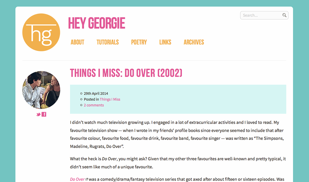
Previously, any images with captions would have a coloured background behind the caption and borders around the edges of the image. To avoid really bad scaling on these elements while maintaining a maximum width of the containing element, I ditched the border and just made the caption an attachment to the bottom of the image. That way, images without captions wouldn’t look strangely different.
Edit (03 May 2014): I had a bit of feedback that the captions were hard to see, so I used the Karla font instead and made the text darker.
Comments
Normally it’s the comment and comment thread styling that takes me eons. But this time I got it out of the way quickly. There was no need for all that metadata to be displayed fancily, there was no need for the Gravatar to be fancily displayed, or for any background colours. It’s all very simple with just a few lines to indicate comment threading.
I’ve had too much trouble with background colours and getting the overall functionality working with the CSS while keeping the HTML as semantic as possible, because WordPress comment threading can be a pain in the backside.
Search Results
I spent a while glorifying the search results with a handful of PHP functions, and it took me a while to work around how the post excerpt worked all around, but I got it working! Now if you search for something like “velociraptor” you will have your search terms highlighted and everything will overall be quite friendly. I’m not too sure the search function is used very much on my blog, but I’m proud of what I’ve done there.
Categories
I also spent time including category descriptions, so if you visit a category – take Fashion Friday, Photoblog and Stories, for example – you will see a small description of the category before the list of posts. I cleaned out some old categories, so hopefully you won’t miss ones like Doctor Who, Reviews, Minecraft, and others that didn’t really need their own category.
404 page
My old 404 page was Minecraft-inspired, with a giant smiling creeper on the page, and me claiming I forgot to install a “door” in my “house”. My current one is – you guessed it – inspired by the Bermuda triangle.
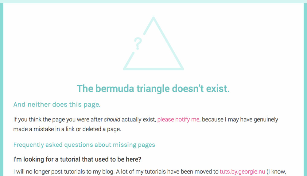
Favicons and app/bookmark icons
Even though I was trying to stray from triangles, I couldn’t help it. I really wanted to move away from the circles I was so obsessed with. I made the favicon a triangle. If you’re on an iOS device and create a bookmark or add to your home screen, you’ll see a custom favicon as well.
Other changes
There are a handful of other changes and bits and bobs. The tutorials have moved to tuts.by.georgie.nu and I will not be posting tutorials here anymore, nor will I be updating the old ones.
I have now written a manifesto called The LZRGUN Manifesto [page no longer exists] to summarise my general views on life (more on that next time, but have a read of it now).
You can also subscribe to my blog via email by using one of the subscription forms either in the sidebar or footer (depending on what device you are using to browse).
Not saying that there are any Easter eggs… but you may notice some other cool things I forgot to mention.
Would love to hear any feedback on the new design. I am expecting a couple of complaints about the bright blue, but I may be hesitant to change it… everyone needs colour in their lives!
Comments on this post
Daniel
Clean. Simple without being overly minimalistic (who says you can’t have simplicity and pizzazz together?). Typographic. Moderately unconventional.
I love it.
I do yet have a couple of gripes with the contrast in some areas, especially the image captions. Perhaps the pale blue backgrounds could use a little less saturation or a little more lightness. Not too close to white, but enough for some of the text to be more readable.
Oh and I think the comment field entry could use a little widening. Is there a way you could make it as wide as the content area? Right now it’s just this little square and it’s a little cramped to type in.
Other than that, I’d be hard-pressed to find issue with… anything else!
Again, I love it. I’m glad I was around to help you with technical issues and constructive feedback. I hadn’t seen the version of your 404 page with the modified logo, though — that’s just about the cleverest thing I’ve seen in a while. Hats off to you!
Congrats on launching bermuda!
Georgie
I can probably make the caption background lighter or the text darker. :) I know some of the contrast would fail level AA for WCAG, actually. I will reconsider the colours.
I thought I had fixed the comment field, but it was probably just the contact form. I can fix the comment field, of course. It does look like a strange square at the moment.
Thank you and thank you so much for your help! :D
Holly
The colour scheme is beautiful and I think it’s really cool how you linked it to the poster. The custom error page is amazingly clever! Love it. :D
I’ve been working on a new layout for my website, and I’m not even joking but there’s a lot of changes to your site that are happening at my site, such as getting rid of tutorials and bringing back the sidebar. Great minds think alike (I swear I am not copying you, I’ve been working on my new layout for months).
Georgie
Tutorials haven’t been a selling point on my blog for well over a year; I can’t remember when I wrote my last one. :P I commend you for being more focused on your blog, too.
I actually wasn’t going to have a sidebar in this design, but when my original postcard-like design failed, it found its way in. I have also been reading more blogs lately, blogs outside of our original “circle”, and took some ideas from their designs, since most of them had sidebars. I missed having the important bits and bobs on the side!
Holly
I’ve been doing the same. I’ve been getting into lifestyle blogs, reading about DIY projects and things like that. I definitely prefer that side of blogging to my current style, which involves moaning about my life haha!
Todd
The new layout looks amazing! I’ve never seen your previous layout, so I can’t compare, but I can tell a lot of work went into it. Great job. :)
I’m trying to take on more simplicity in my designs, but it’s easier said than done. I tend to want to over-complicate everything. And I love textures too much.
Vicky
Hey Georgie! It’s been such a long time since I last commented, wow.
I’m in love with the new design – it looks great on both my iPhone and iPad, great job. :) I love the colours you’ve used and they look great on my iPad. It makes me miss my website (which I still own, as it goes), but I just don’t have time anymore. :(
I hope things are well with you and I hope we can keep in touch more often! ♥
Georgie
Thanks Vicky! :)
Well, I’d be inclined to say you certainly do have the time because you can’t possibly be working your butt off every minute you’re not in the shower or eating or travelling. But, don’t let me be the judge. :P
Personally, I found it was more about priorities. I know I have time for things because I’m there having drinks with workmates after work, I’m reading a book on the train, I’m watching episode after episode of some television show. But why isn’t X getting done? X is not getting done because it is not a priority, whereas Y, Z, and B are. I’m really only trying to convince you to blog again, but remember I’m always an email away if you want to chat. ;)
Vicky
Okay, you’re right I probably do have time. I just have no energy when I get home from work, however, I have just renewed my hosting for my domain. I’ve just been promoted at work so I’m a duty manager now. :D I’m going to be working 11pm – 7am starting from the 12th May, so we shall see. :P
I can’t been remember how to code and I haven’t got any recent backups so this will be interesting, haha. I’ll keep you posted anyway. XD
Liz
:O VICKY!! YOU’RE STILL ALIVE. 👏 ♥ /love /mwah 🙄 /rose
Cat
Love the new theme! I actually like all the bright colors, especially the combination of the blue and pink :) I can totally see how this was influenced by the poster and thought that was neat. The triangle logo is clever too!
I have to admit that I didn’t notice the image captions when I was reading through the entry. It might be the contrast issue that Daniel was mentioning because I just saw it as a blue bar at first.
Looks great overall though!
Georgie
Thanks Cat! I just went ahead and changed the captions so the text is darker and should be easier to read. :D
Alice
I love love love your new theme! ♥ Fell in love with it when I first saw it: triangles are fucking awesome (haha) and I kind of adore the bright teal / pink / white color palette? A ton? But yeah :p I’m probably too in love with your theme to provide any criticism haha. I love the format of everything and the little subscribe-to boxes are so professional and whatnot! I definitely love that you decided to go from scratch instead of changing the colors on your old theme, as lovely as it was.
Gonna go hunt for the other easter eggs now :p
Liv
This is a lovely new theme. Your typography has improved a lot, which is great! :D I’m really digging the colors too – they are similar to a website my friend and I are working on for our senior thesis – except we have more yellow and some darker teal. And I’m not sure if I’m seeing something different, but you did mention you are in love with the blue background. I see a teal/cyan background?
The Bermuda Triangle doesn’t exist … that’s a good one. I’m hoping it refers to the fact scientists disproved it recently, rather than all the supernatural stuff that supposedly happens there. XD
Sign, if I could write as much as you can about the design and development process of a website then I’d have this thesis done. -_-
Georgie
Yeah I do mean teal. :P But it’s sort of a shade of blue so I kept calling it blue.
Definitely to do with the disproving – I never believed in the legends, as interesting as they were. :D
I think I enjoy writing about the process of design, I guess most of it comes down to all the decisions that you made. No doubt you make a handful of those, so I think the best way to weave out words is to write about why you made certain decisions. I mean, why did you choose yellow? A happy and welcoming colour, perhaps [include literature references here, haha]? Maybe you had other colours in mind, or maybe you chose it because it was a contrasting colour? Good luck though, I’m sure you can write pages and pages and it won’t be too difficult!
Valerie
I love this new theme! I may be biased because I love the teal color, it’s my favorite! :) I like that it’s simplistic and yet still unique.
I really need to work on my own blog’s design. I’m just not really that good at graphic design or programming. :(
Vanessa
Very nice theme. :D Love the colors too.
Jamie
I really love the idea and the colors! You’ve outdone yourself once again! I had a long comment, but I forgot what I was going to say. But I really do love the colors, as you know blue is my favorite and I love the design!
Bhairavee
Wow, I’m visiting your site after such a long time!
I absolutely loved your new theme!
I wish I would be able to design one theme properly for wordpress some day in near future! Your logo is looking awesome. and the colour combination is great!
Bubblez
I really love this new theme! It’s so pretty and summer-y! :)
Glad to see that the tutorials are still up on a different page.
Liz
I was just typing in your address to maybe see a new design, AND WOAH I DID. It reminds me of candy/bubblegum and the late Australian series Dance Academy.
I love how vibrant it is.
The use of triangles is another thing I like about it, because I like triangles. :D
This one is really amazing, and it’s a bit comforting you made it the way you did because it shows a different style from what you’ve made in the past, and it’s similar to a particular style of something I was wanting for the new project
but not exactly like this, just…because it’s elegant and detailed but still simple-looking… Minimal? Yes, I think that’s it.The footer is playing with my eyes and making me feel like it’s slanted. >.>
Liz
P.S. The left border is a nice touch. (Y)