New logo and new blog design – v5.0 Honolulu 🏝️
HI EVERYONE. 🤪 I’m excited. It’s a good thing I seem to get excited every time I write a new blog post, right? Nothing worse than “I’m sorry I haven’t blogged!” – which I’m sure a lot of people might recognise from an era about ten years ago when people would apologise for not blogging. 😅
I’m just gonna dive right in. I have a new design up on my blog and this is that official release post about it! 🎊
New logo
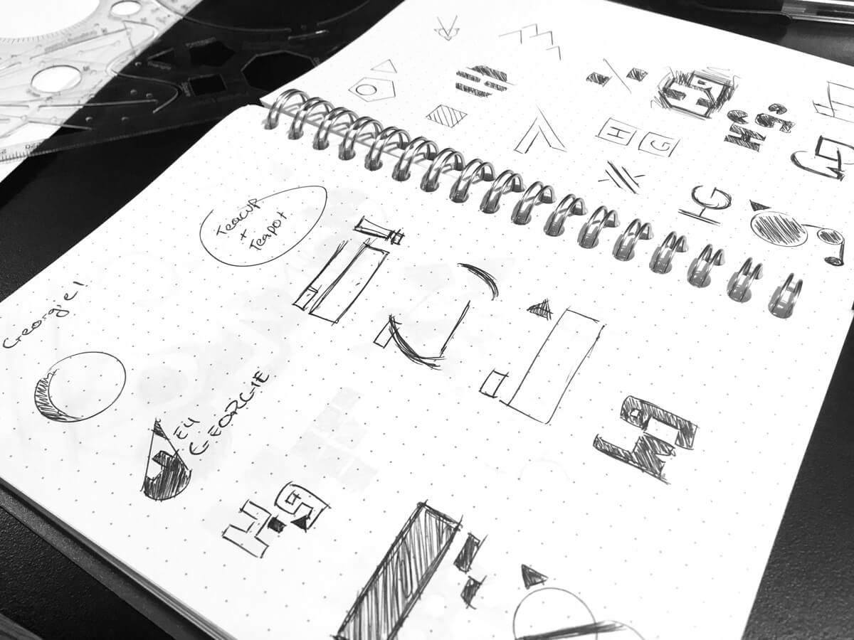
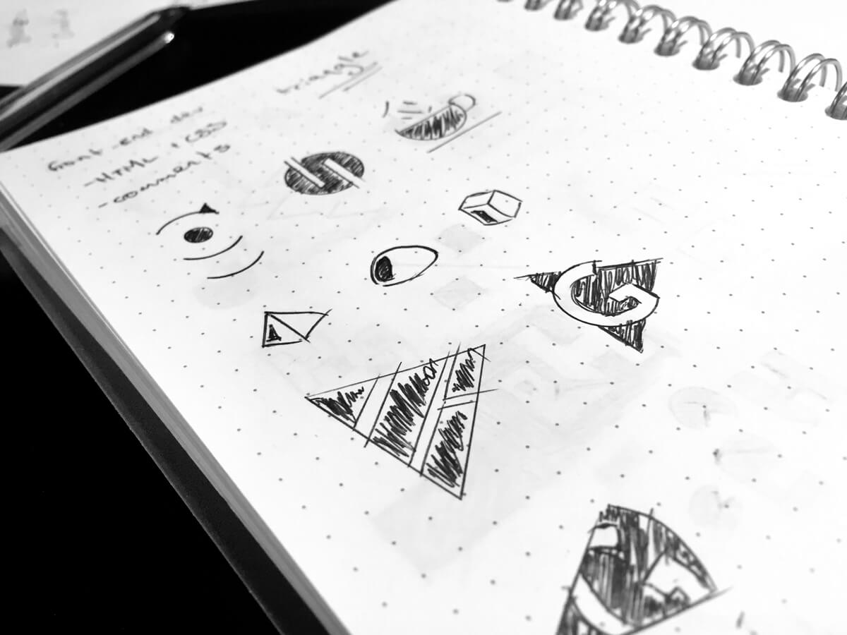
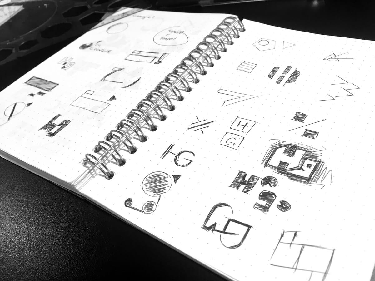
This new design of my blog is something I started working on a few months ago, but it was last year that I commissioned my friend Ash Vadolia to create a logo for me. He worked with my budget and I gave him a lot of information about my blog and its history, and what had/hadn’t worked for me in the past. I’ve tried making a lot of logos myself but none of them stuck. I previously had a white triangle as my logo (which you may remember if you have been reading my blog), which I only created to fit with the theme of “bermuda” and the Bermuda triangle, but then it stuck. I didn’t feel like this triangle represented me in any way.
Here are some words from Ash about the design process:
Late last year, I had the chance to work with Georgie to re-brand her blog. Luckily for me, she was a client that knew what she needed, along with what we could accomplish with her budget. Her decision making process was ideal for a client – smooth and given reasoning, understanding of the possible brand direction.
Being a blog-site, it really only needed to represent Georgie. After some chat, we came up with words that helped build a bold, simple and strong image, while also coming off as a little clever.
The triangle she used before, had the problem of not being recognisable or unique enough. It also had very little application away from her site. The new shape of the logo came from a hemisphere that refers to the “all-rounded” approach of her blog. The letter G was placed inside a number of different orientations of that shape and the final result ended up working best – using it reversed-out of the shape to make it noticed with a second-glance. The only main difference I wasn’t responsible for was the colour change.
Ash did a really great job of taking all this information and creating a logo that fit with what I needed! 👏 I had pulled together links to a lot of logos I liked, and I think the main styles I was drawn to were simple logos, unusual shapes, and logos that had a bit of a clever cut-out shape or use of whitespace. This logo is the letter “G” cut out of a sideways dome/hemisphere shape. After the design was finalised I actually showed it to Jane and my brother Brandon, and both of them said it took them some time to notice there was a letter “G” inside the logo. This is exactly the reaction I wanted, that “ah!” moment. 😆
Accessibility: Colour contrast
Ash had actually created my logo with my previous colour scheme, which was an aqua/teal colour. However, I changed the colour as I had an intention to make my blog more accessible and have enough contrast to be an easier read for the visually impaired. I wanted to make it bold and clear.
It was very hard changing from the colour I got used to calling “bermuda”. I decided to change the colour to something else and simply grin and bear it. I toyed around until I found this deep blue that gave enough contrast with a light background. After all, I like the colour blue, and have taken a liking to the colour navy as of late. 🙂
It was a bit difficult paying attention to colours as I designed and built this new look for my blog. Accessibility is something I have cared about for a long time, but I haven’t always double-checked my projects or work for issues until recently. The biggest challenge is wanting to use bright or really nice colours while still trying to ensure there is enough colour contrast between text and background elements. It’s not easy to find “nice” colours that offer enough contrast with black or white. Needless to say, I used the opportunity to make some parts of this design very bold – the titles of blog posts dark and large, the 404 error page (oooooh!), and code samples, such as the one below, which shows some of the SASS variables I used in my CSS:
// Variables for colours

$bg: #fefefe;
$bg-dark: #f9f9f9;
$bg-translucent: rgba(255, 255, 255, 0.75);

// Primary

$primary: #0e7ea2;
$primary-medium: #108c98;
$primary-dark: #006586;
$primary-translucent: rgba(80, 200, 196, 0.05);
$primary-translucent-dark: rgba(124, 215, 215, 0.4);
There are hot pink and purple colours as well, and you might notice that the comment forms and comments (you’ll see if you post one!) are bright while still having enough a good colour contrast ratio.
🌈 Colour palette
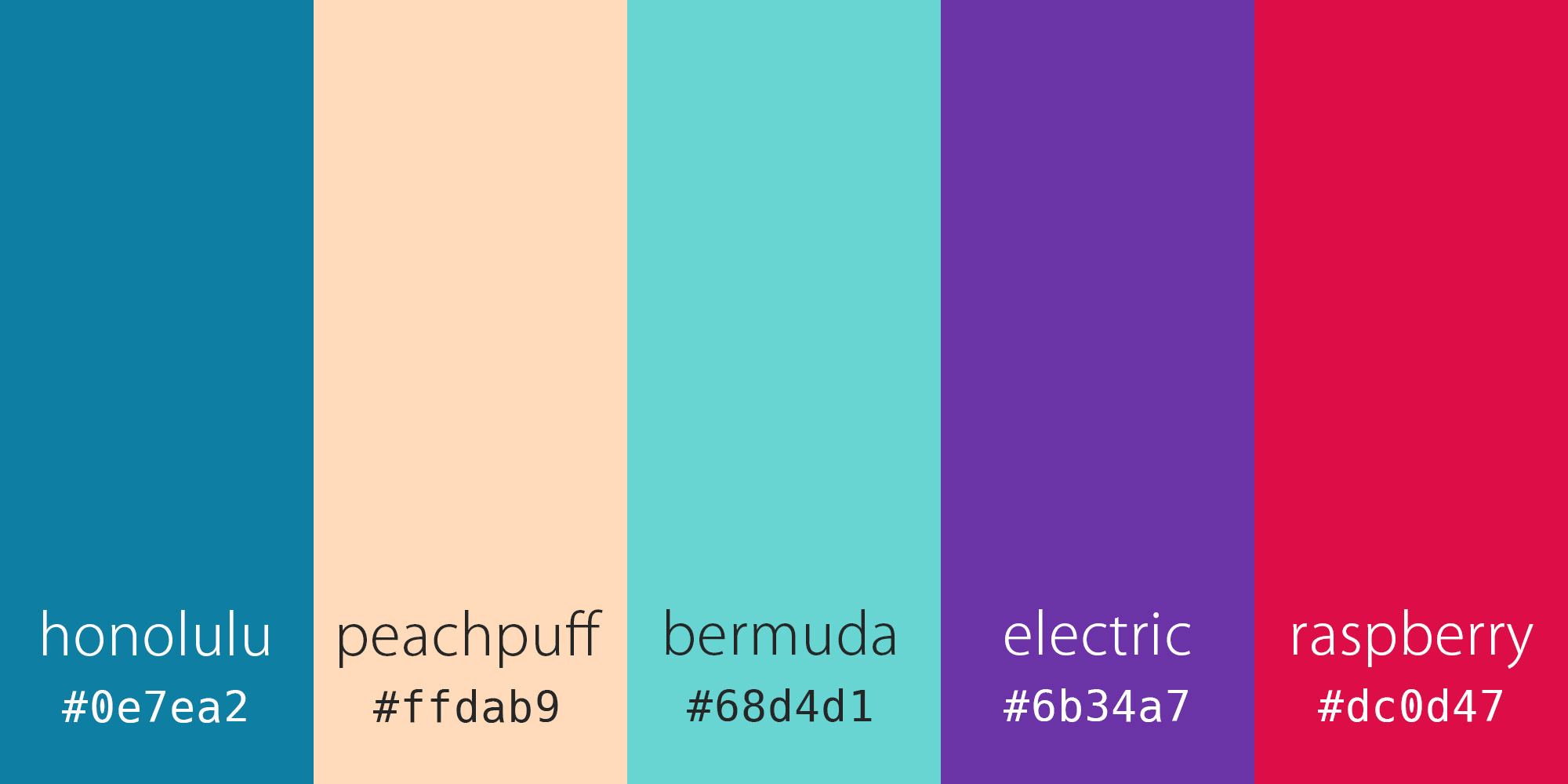
I wanted to imagine a good colour palette while designing this. I didn’t have one to begin with, as I mostly used the dark blue, black and white. I gradually introduced more colours into the design that complemented the blue. As I did this, in my mind I visualised a colour palette that had strong, bright colours, but that would be used sparingly throughout the design. At first I settled on a brown, which reminded me of the unusual combination that blue and brown make – something that reminds me of muddy jeans, and a textured banner I created for my blog header in 2009.
The brown was not exciting enough though, so I settled on a lighter colour: peachpuff, which is a legitimate CSS colour name. This is a bit of an inside joke: I created a CSS pop quiz for some of my coworkers (not front-end engineers) to be exposed to HTML and CSS, and put in a handful of values for color in CSS, and asked them to choose which one was not a valid value. To throw them off, I put peachpuff and lemonchiffon (both valid CSS colours), and they were astounded to discover that peachpuff is indeed a colour. You can see it used in this design for horizontal rules and for accents on image captions, as well as for a border around comments, and the focus state for links! 🍑🙌
I already mentioned that it was hard to really let go of and stop using the colour bermuda, so I weaved it into the code block styling.
I wanted to give each colour an individual name as well, and after battling with the name for this blue colour, I settled on Honolulu. “Cerulean” and “Aegean” just weren’t doing it. It turns out the team colour of the Detroit Lions is “Honolulu blue”. Maybe I nicked some inspiration from there, but…
Visuals
I had received feedback in the past that my blog was not super visual and could probably benefit from more imagery. I had obviously taken the goal of improving performance and loading time too far by removing almost every image. 😪 There are now visuals on the homepage, category pages, and tag pages.
I had drawn a few sketches around how I wanted the layout to look. I wanted to embrace CSS grid (which I ultimately did!), but I wanted it to look a bit magazine/editorial inspired, which is why the captions and the date pop out from the side of the main content. It was actually a really busy sort of layout initially, which I didn’t favour, and it was hard to make it work. I had wanted small parts of the homepage grid to highlight certain posts or include “advertisements” for individual categories or “featured” posts, but it was a little complex. I kind of took the easy way out when I made all the thumbnails the same size instead of various different sizes – but maybe this is something I can explore in the future.
The cropping and positioning of the images is done automatically, so I’m aware that there are some thumbnails where the images look cut off or just weird. 😆 I haven’t really thought about how I will deal with this in the future, but I’m open for changing it or making it a bit different!
Name: Honolulu
The working title for this design was actually komodo, after the island in Indonesia. I’d followed a bit of a pattern with oceans and islands and seas with my previous blog designs, since having the previous aqua branding:
- 2nd May 2014: v2.0 bermuda
- 4th August 2015: v3.0 Atlantis
- 24th February 2016: v4.0 Flores
- 4th June 2018: v5.0 Honolulu
I’ve taken to naming my blog designs using semantic versioning. In the past I didn’t know anything about version naming. 😛 I’m going to have to go back to my previous posts and make the relevant updates. But this is the fifth design I’ve had on my blog since renaming it Hey Georgie, so that makes sense to me. 👍
Other notes
(Edited to add) I did get quite a few questions about how I built this design – it’s a WordPress theme built entirely from scratch, so I haven’t used any frameworks or parent themes. This is how I’ve built all my themes from day one of using WordPress (almost ten years ago). I just don’t like the lack of flexibility that comes with a ready-made theme or template. I design my own themes too, I occasionally sketch things but otherwise I work solely in the browser and develop in the browser. 😅
I built this while checking mostly in Chrome and Safari (which explains why a couple of the reported – but now fixed – bugs occurred in Firefox). I use Sublime Text as my code editor and use SASS for my CSS.
🐞 Bugs
Instead of my usual perfectionist testing practices, I’ve decided to throw this design out there with minimal (but acceptable!) testing. In the past I found that no matter how throughly I tested my designs (even ones for clients), there was always something I missed that someone would pick up on almost immediately. I decided to stop freaking out about it and just embrace that everything is a work in progress (much like my attitude on fitness and bodybuilding).
So I’m just putting it out there that there might be broken layout issues I could have missed. I will definitely admit that there are a handful of things out of place. 😄 I’d appreciate it very much if you could leave me a comment or send me an email with details of any issues so I can fix them.
As I mentioned earlier, I am aware that the visuals might not look great in every instance. I am also aware that the comment form looks a little bit like a hot mess when replying to comments.
Something to note is that I no longer believe that websites need to look the same in every browser/device/operating system – this is a “myth” that has been long debunked. It’s much more important for a website to function, be navigable, and legible (for reading). That said, the fact that a lot of bells and whistles in this design are “missing” on smaller viewports and when you view it on smaller devices is not a bug. 😉 I also prioritise modern browsers over much older ones.
Bugs reported
‼️ indicates high priority. ❗️ indicates medium priority.
- Large whitespace under footer in Firefox fixed!
- Post metadata is not clickable in Firefox fixed!
- ❗️ Comment is not shown as being under moderation when comment is posted fixed!
- ‼️ Topmost link in navigation is not tappable on mobile devices fixed!
- ‼️ Search input dismisses itself when the input itself is clicked fixed!
- Layout is broken in Edge 15 – low priority, but let me know if you have issues in Edge 16 and above
- Blockquote looks dodgy on smaller viewports fixed!
- Blockquote looks dodgy in comment replies (lol) fixed!
- Navigation on mobile is slightly cramped
- ‼️ Double-tap link issue on mobile because of relatively positioned links fixed! (need to write a post about this!)
- ❗ Thumbnails for iMessage preview and Twitter cards are outdated fixed!
- Introductory profile copy on homepage is possibly too large on mobile
- (backend) emoji from author profile doesn’t display properly fixed!
📮 Feedback and suggestions
I welcome feedback and suggestions. If you don’t like what you see, it’s unlikely I will completely change the whole thing, but if something is a serious problem, I’m open to fixing or changing it. “I hate blue” isn’t going to work on me, sorry. 🙂
It’s not really an Easter egg, but if you try to search up something silly like “aaaf”, you might be amused by the search results page. That said, I know the search function doesn’t seem as smooth and it looks like I slapped it on. In fact, I forgot about it until the end. I always do that. 🤦🏻♀️
In closing, check out the logo mark at the end of this sentence!