Designing in the open, apparently
I’ve been spending some time up in my blog’s CSS this weekend, re-doing some of the typography and going for a simpler approach with some of the design. Since writing CSS is 98% of my job anyway, I don’t really mind… but I’m still shocked at the tendency I had to over-engineer certain things. 😂 I decided to fuck off with a preprocessor and “just write CSS”. I miss vanilla CSS. (Still, I find some of my CSS shameful, and most of it was just a refactor. Please don’t look at my source code. 💀)
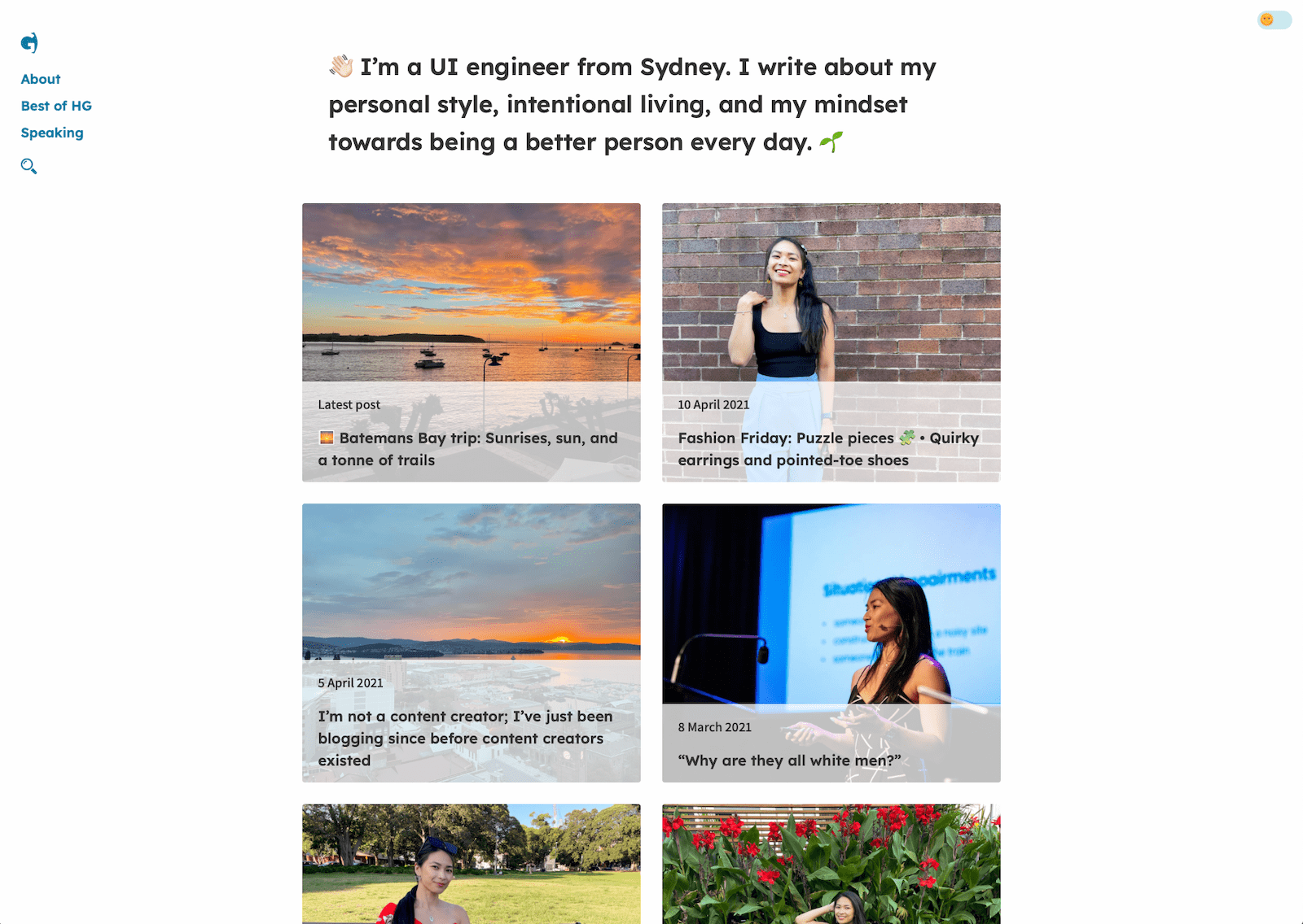
It was mid-2018 when I released this existing design that I named Honolulu. I can’t believe that was three years ago. I generally find that two years pass before my blog designs seem to date…
Girlfriend thought she was being so clever and creative with the date flying off to the left, and the captions being in an invisible left column, and the grid post display. I mean, design trends, right? 😛 I think, though, similar to my personal style, my tastes in design change, even if I don’t follow any kind of trend.
I’m not a designer by trade, so much of my “designing” happens in the browser, and I’m usually pretty open to improving UX where I’ve accidentally made it shit. I care about it, but… but this is also just a blog. There isn’t a lot to consider when it comes to the experience, at least compared to a more complex bit of software or an app (hello, my day job). I felt like I needed to embrace more simplicity in the way my blog looked and felt, as well as having it feel more clean. After working on Jane’s blog design, I was inspired to update mine to feel more refreshed and clean.
Typography changes
I changed the font of the headings from Poppins to Lexend. Poppins was round, and fun, and easy to read, but it felt a bit childish and I wanted something that was still sans-serif and somewhat bold and round, but more “grown-up”. I settled on Lexend because it had a bit of spunk.
I changed the body font from Libre Franklin to Assistant. I don’t know what it was about Libre Franklin, but it felt somewhat corporate and boring for a blog. When it comes to body type, I like fonts that are not round at all, and somewhat tall and narrow – but not condensed. PT Sans, Source Sans Pro – and other fonts similar to those – are in the realm of what I like. They are also not too thin or thick.
The other thing that bothered me immensely about Honolulu is how clever I tried to be with the colour palette. 🤦🏻♀️ I tried to use five colours, because the idea was that I wanted something pretty light (well, before dark mode became a thing), with “splashes of colour”. 🎨 That worked really well, but felt a bit mishmashed in practicality. Again, I want to simplify what’s going on there so that the look and feel is cleaner.
The guise of perfectionism and the need to publish something “complete”
I don’t think it’s all “perfect”, but then again, what is the point? Perfectionism is a guise for the discomfort that something brings. We’re all afraid of openly working on something, or putting out something less than perfect, because we fear judgement, or that people will see our mistakes. I’ve decided to be OK with that. Even after having worked away for hours on Honolulu, thinking that it’s ready to go, I put it out into the world knowing that it wasn’t 100% complete and that there would be some issues I’d have to fix, or feedback to address. (Heck, the dark mode wasn’t even there until dark mode was a thing.) So what’s the harm in publishing an update to the typography on my blog even though there is more I’d like to change and improve?
Frankly, I’m over all the “versions” and “editions” I used to create for my blog. I’ve had some five versions of Hey Georgie’s design since 2012, and when my blog was under a different name I had over 15, and before that I had upwards of 44 different themes/designs that I changed literally every two weeks. I mean, I knew nothing about design back in the early 2000s. 😛 But in 2021 – and I mentioned this in my blog post a couple of weeks ago about not being a content creator – my blog is something that grows with me.
And it’s not just the writing in my posts, but it’s how it looks and feels and how I express myself with it. Gone are the days when I’d come up with a fancy-pants new idea and overhaul my blog’s design, and then drop the curtains and show it to the world. Welcome the days ahead where I’ll make small improvements over time – in my own time, and when I feel like it – and am open to feedback and critique. These days are the days I care just a little bit less about aesthetic and a bit more about the writing, but not so much that I become a clone of the publishing platform everyone (including myself) loves to hate that starts with a letter M.
Other updates and what’s ahead
I removed my poetry collection the off switch is broken from the main navigation, and the archive (because ugh, why… and that page is ugly). But in super fun updates, I updated my About page to be far more succinct – and you can actually find a discount code for #tosib there. 💰
You can expect more gradual updates and improvements to my blog over time. I don’t really have a list of things I want to fix. I think I’ll just poke through my blog and see what I come across. Kind of like housework, you know? 🧹😆
I mean, was just thinking about how the categories are quite disorganised. What is the category for this post? Does it even really matter? I think it should belong in something called “Blog” but I rarely talk about the literal technicalities of my blog, so maybe it’s time to create one? 😂 Yeah, fuck it, I’ll create one. 😝
The title and premise of this post was inspired by Brad Frost’s article from 2013, Designing In The Open. Even eight years on, it is a concept that has stuck with me and that I really take a liking to.