Updated design: bermuda v1.1, ‘Atlantis’
I just deployed a new design to my blog. The bright turquoise/teal was getting on my nerves. I knew full well when I sent it live in May 2014 that someone was bound to complain about the bright colour. No one complained, and people began to associate the bright colour with my blog, so I started to think of branding and associating certain colours with my blog.
It was hard to let go of the teal, but I am using a more toned down version of the colour now.
Farewell ‘pinky’
Good old pinky. I asked Nick, my brother Brandon and my friend Daniel for their opinion and all three of them said the hot pink was a nice touch, it was ‘actually kinda nice’, ‘gonna miss it’, etc. Pink is my least favourite colour, and although some things are nice in pink, it wouldn’t be my first preference if I had another choice. Of course, in my documentation of bermuda, I based the design off a Hey Geronimo tour poster, so letting go of the pink was hard, but I was just getting sick of it.
I’m not sure why I chose a shade of red/coral, but an old design I did for my blog was titled Strawberry Custard and had a similar shade of red, which I really liked. Despite red being my favourite colour, I didn’t want to use too bright a shade and put back the brightness I was trying to remove!
Before/After
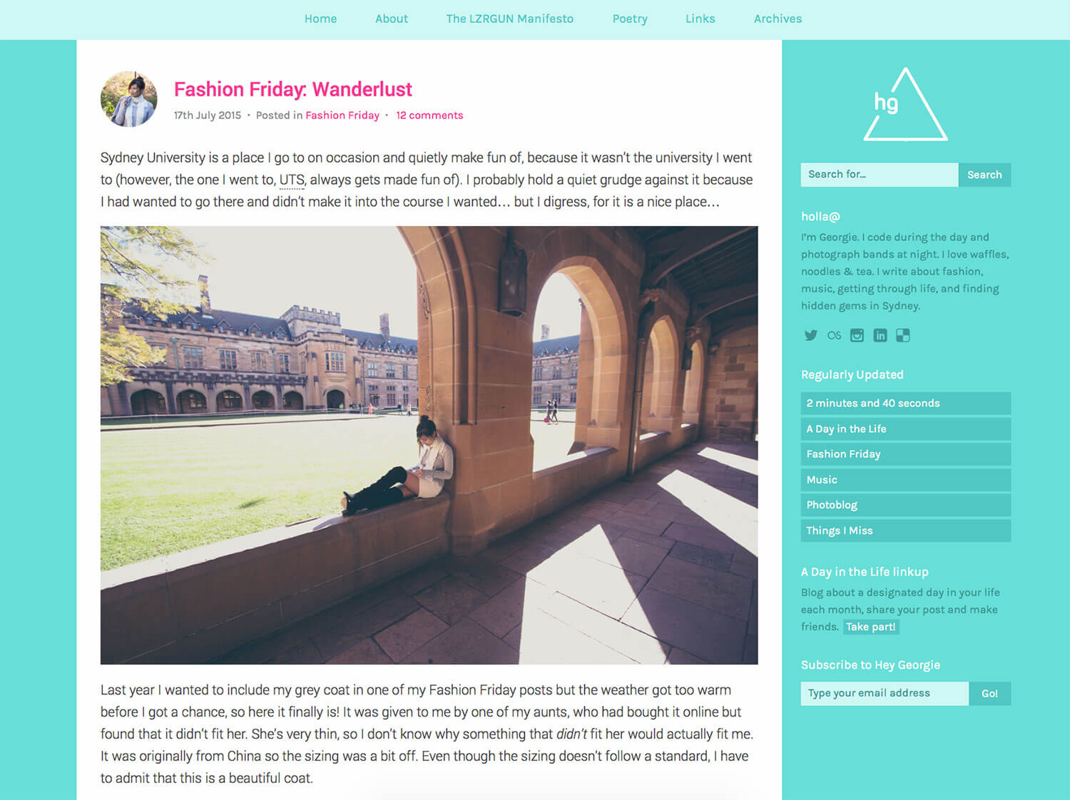
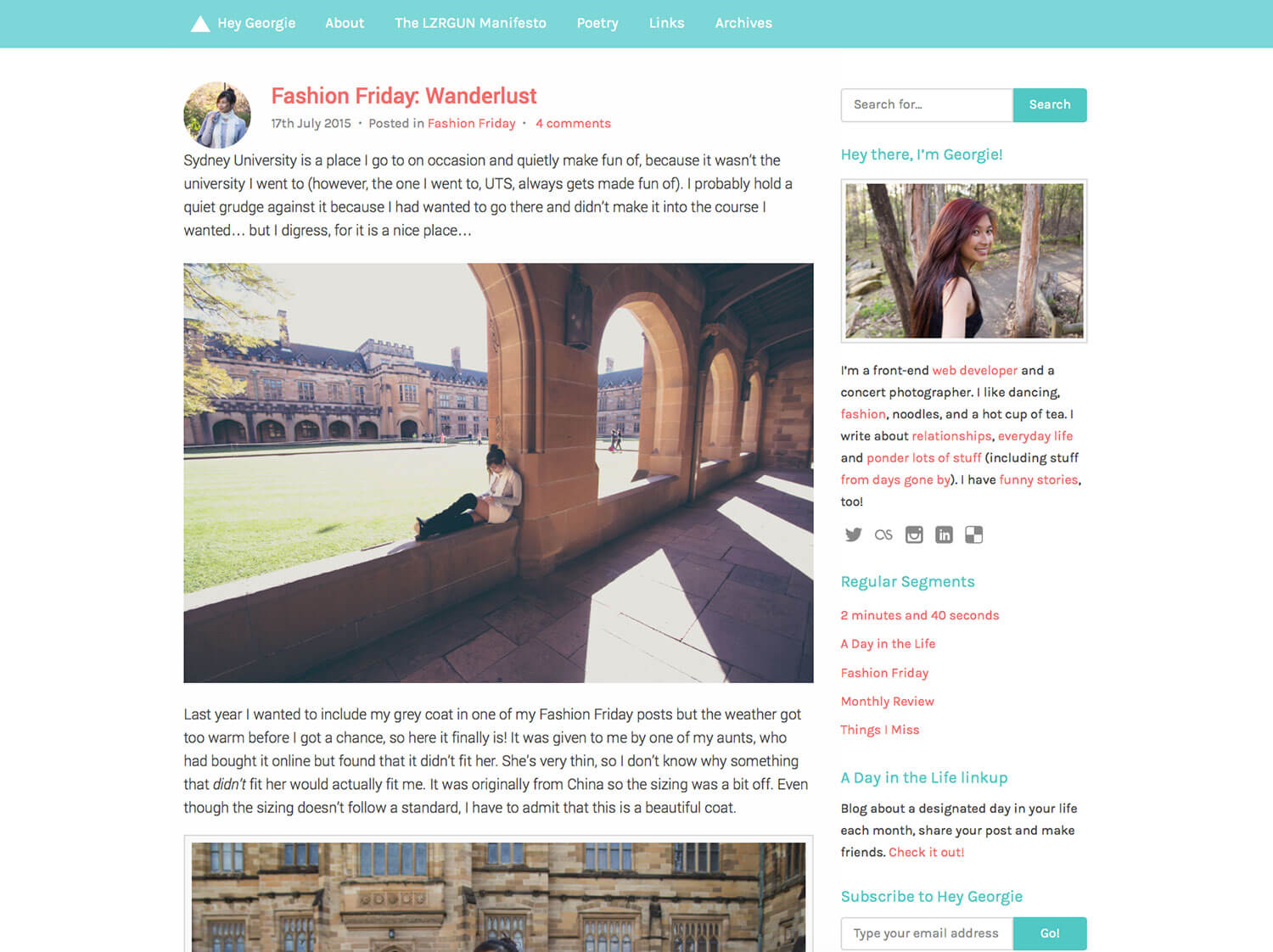
Bring back the rounded corners
bermuda was a silent protest to the work I had to do at my previous workplace. Making the tiniest of tweaks to small components was a pain in the backside, so I made all inputs and buttons have square corners, had no transitions whatsoever, and even avoided using border-box.
So in this design I decided to bring them back. And I added subtle transitions to hover states. I brought it all back subtly. I haven’t checked if performance has decreased simply because of these tiny changes, but I know that there is still a lot that can be cleaned and removed from my CSS.
Stripping out unnecessary CSS
In CSS Adventures: Converting from Stylus to Sass, I mentioned:
My CSS, unminified, is 23KB, and minified, it is 19KB.
(Also, look at that blockquote, doesn’t it look fab?)
Well, now my CSS is 19KB unminified, and 15KB minified. I did a good job cutting out what I didn’t need.
Using rem units instead of em units – sorry IE8!
It was a huge (not really) sacrifice to use rem units (relative em units), but I have stopped supporting IE8. At least I can say that yes, my website works in the browser, but I have not gone to the effort of making a separate stylesheet or including IE8-specific styles to remedy the fact that IE8 does not support rem units. My total traffic from all IE in the past month was something under 2%, so I don’t think too many people are missing out.
That said, using rem units has made small details like margins and padding much easier to deal with. In setting a font size and line height on body, I was able to easily scale that up for larger displays simply by declaring a font size in rem.
I think there are some units that I have set to .9rem, for example, that look a tad too small, so they ought to be something like 1rem, anyway…
More interesting and readable image captions
It looks much better now, rather than a coloured block of blue. The captions actually look like captions to the image.

Other small improvements
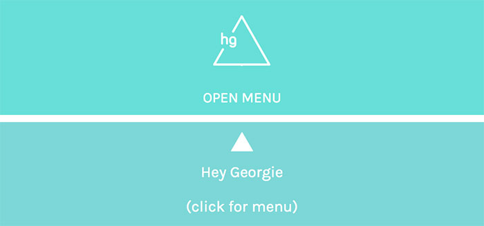
I updated the mobile navigation:
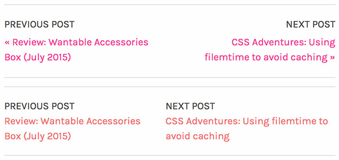
I also decided that the in-post navigation was too confusing with the little arrows and the next/previous post text should communicate more effectively, not to mention the positioning of the elements. Rather than making the item on the right aligned to the right, I just made both items left-aligned and they will shrink or grow to both occupy as much space as they need as long as they are both on the one line.
Improved sidebar (somewhat)
The sidebar is on my list of things that could still be improved, content-wise. Let’s hope that including a friendly photo of yours truly, along with a brief introduction, will get more people reading my posts.
I’m thinking of adding recent posts to the sidebar as well, as people may not scroll through the posts on the homepage, or even go much further.
Let there be bugs
I only meant for this to be an MVP, but I spent a lot of time on this update so it’s probably steering more towards an actual definable release. There are undoubtedly some bugs that need to be fixed – I know there is a bug with the button on the contact page (which I also still need to bring to prominence somehow, it’s hidden in the pages).
The footer is yuck and needs some real content, and I still plan to improve the experience on smaller screens/phone view, as there is too much content to scroll through in the post excerpts.
EDIT: Known/reported bugs
- Navigation is on two lines on tablet view. [Nick] I would not really call this a bug, it still works, but yes it needs fixing.
- Checkbox is out of line for logged-out users. [Rachel] I just noticed it borks when you click it, too. Such bad UI, oops.
- Some padding discrepancies for the ‘Continue Reading’ links and the start of the post content.
Hello, Atlantis
Since I feel like this is an obvious change, I have decided to still call this overarching theme bermuda, but this release is called Atlantis, for hilarious enough reasons that the lost city of Atlantis is a story just like the myth of the Bermuda triangle.
There are probably other bugs and issues. If you notice any, please let me know. I know this isn’t a perfect version and everything is always improving and changing and I definitely do welcome suggestions.