Mixin’ at Mixin Conf 2016 💜
I spent Friday in Perth at Mixin Conf. I had such a great time listening to all the speakers and chatting to people in the community. I also got to meet some of the people from the Mixin team who were actually pretty stoked to have someone visiting from Sydney and also be so pumped about the conference. :D
I can’t remember how I found out about the conference but I did submit two talk proposals when I found out about a call for proposals. I must have seen it promoted on Twitter or somewhere else. I was unfortunately declined but I tried not to get too down about it – it turns out there were a heck of a lot better speakers in the end, some international and very well-known, and they were definitely the better choice. ;) Because of that, I still very much wanted to attend the conference. I missed out on early bird tickets because it was pending a decision from my company (they kindly paid for the conference and flights!) but didn’t want to miss out on the conference.
And I am so glad I attended because it was not only a lot of fun but the speakers’ talks were amazing, educational and eye-opening. This is only my second conference but it has set the bar pretty high. The Perth web community is very close-knit, and I think Mixin really showed that.
For some reason, I had woken up at 3:30am and unable to go back to sleep, so I ended up going to the gym around 5:30 and grabbing breakfast at Flora & Fauna cafe before the conference. We were treated so well and they really took my dietary requirements into account when they packed our personalised lunch bags. 😍 We also got shirts. I don’t know if all conferences give out shirts (this sets the bar high, guys)…
I attended the conference afterparty as well. I made myself go, even though I was close to passing out because I had very little sleep that day. I am usually not one to go to parties and socialising is a difficult thing for me to do often because I am so introverted. But I had met so many great people that day and I wanted to continue having great conversations. So after a quick change of clothes, I walked the 25 minutes there, hoping like hell it would be worth it.
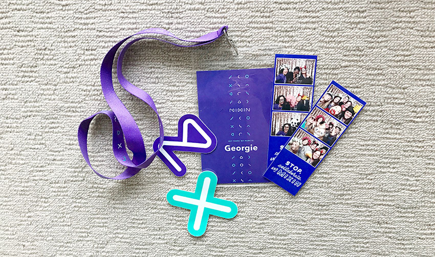
It was! We took hilarious photo booth photos, I met more new people, and there was a lot of dancing. I don’t know what it is about other scenarios, but I didn’t find myself embarrassed to dance. My dancing background is not something I am ashamed of but I just don’t feel right dancing if no one else is putting in the effort. And believe me, everyone was having a really good time. :D
As for the conference, I have outlined my notes and takeaways below. I was most excited to see Una Kravets talk, because I am such a big fan of her work. 😍 I got to have a good chat with her which was honestly such a privilege!
Art Directing Web Design – Andy Clarke
Andy Clarke discussed taking web design to the next level. By taking inspiration from print and leveraging grid systems in a better way, he inspired us to think outside the box and recreate webpages to make them stand out. He reminded us of the era of hit counters and guestbooks, and mentioned our infatuation with processes like Atomic Design (Brad Frost) and tools like pattern libraries – things that we often stick to because we fear criticism or failure for our work.
These processes need art direction to be meaningful. Without art direction even the most attractive atoms, molecules and templates, have little more than superficial looks to unite them
Notes:
- we fear criticism or failure for our work
- art direction improves what we make for the web
- shoutout: Trent Walton, who creates a design for each of his blog posts
- the art of distilling an essential, precise meaning or purpose from a piece of content
- art direction can not only establish relationship with content, but connect someone to the spirit of a brand
- pull quotes can be used to lead people’s focal point
- every element presents an opportunity to be creative
- using CSS’s first-line is actually marvellous for responsive design
- Mark Porter: design is being in charge of the distribution of elements in space
- the problem is not Bootstrap – it is our lack of knowledge on how to use grids creatively
- layouts where size corresponds to Fibonacci numbers can actually have really nice rhythm
- grids anchor our layout but don’t contain the items on the page unless we make them do so
- combining two grids (compound grid) is an established design technique
- we are not limited to vertical grids, horizontal fields can create imaginative layouts
- an interesting way to use figcaptions – use CSS flexbox to align the caption or reverse the order
Working with Images – Una Kravets
Fangirling right now because I love Una’s work on CSS blend modes. 💜 Although her talk was not focussed on this, she totally found a way to weave it in. Giving a detailed analysis on image file types and performance, Una shared her love for ImageOptim, Bob Ross (aww yissss!), batch resizing via the command line, and up-and-coming image file types.
Less colours, less problems!
It was most interesting to see that compressing images with certain tools resulted in images where you couldn’t even see the difference with the naked eye – yet dozens of kilobytes had been shaved off. Also a trick or two: blurring parts of an image makes it smaller in file size. The technique is also great for perceived performance (check out Medium). And what really made Una say, ‘less colours, less problems!’ is the fact that black and white images load faster than the original coloured image, not to mention the same happens with a coloured CSS blend mode versus a pre-edited image.
Perhaps something that would be embarrassing is the fact that Una analysed the Mixin website and found that the Mixin team could serve their images better. But she only suggested this with the best intentions. She ended with a final note to be aware of emerging image formats, educate everyone about what you can do with images, and to find balance. 🙌 Oh, and optimise your images. :D
Notes:
- the best camera is the one you have with you!
- there is an increased use of cameras in smartphones
- better compression of PNG (go for 8bit rather than gif)
- JPG will always decrease the image quality
- WEBP – lossy or lossless, animated format support, better compression than JPG. saves 30%
- predictive: using values of the neighbouring blocks of colour
- Safari: JPEG 2000
- IE/Edge: JPEG XR
brew install imagemagick- BPG – better portable graphics / replace JPG
- FLIF Free Lossless Image Format – smaller than literally everything 😜
- FLIF is responsive – browser can decode and render the quality of the image ahead of time! 👏
- use progressive JPG if you can – it loads with low quality, and quality increases as the image loads, not in strips/lines like baseline JPG
- GIFV by Imgur – GIF or video depending on how fast it is
- Why video over GIF? They are compressed differently
- GIF saves every single frame (intraframe) and it is sent to the server and runs through the frames
- Video encodes differences between frames
- don’t send an image larger than it needs to be.
Pencil Mileage – Alice Lee
Alice spoke about the process and psychology of learning. She only became an illustrator four short years ago, and previously did not consider herself a creative at all. She attended business school, which she described as the total spiritual opposite of art.
So she started out as a ‘total noob’. And she explained, using four quadrants, that we often go from feeling excitement and not knowing of our incompetence (unconscious incompetence), to knowing we are a total noob (conscious incompetence), to not realising that we have actually become better (unconscious competence), to knowing where we stand and how to rate ourselves (conscious competence).
We need to give ourselves space to be human and not to be so strategic about our careers
Alice’s talk really resonated with people who make excuses from learning or moving forward, and encouraged us to make small steps, because even these can often elevate you. More repetition builds familiarity with what you do. She encouraged us not to burn ourselves out but to challenge ourselves in a low way.
Notes:
- be optimistic – have friendtors (friends who are mentors)
- knowing you are a noob means you are halfway there!
- shoutout to Allison House who mentioned that life is cyclical, and sometimes you just need a ‘reset’
- once you are aware of your competence, you can harness this internally
- ‘What is that thing you want to do that you keep talking yourself out of?’
Full Stack Anxiety – Joel Califa
Joel started out graphic designing “educational Counter-Strike posters”. It was hilarious seeing his early designs because it was a lot like what we were used to seeing on the web and we thought it was amazing. I know I am embarrassed the old graphics I designed. Joel also took us down memory lane as he brought up Neopets, and the fact that you could learn HTML and CSS from making PetPages. He reminisced over Frontpage and Flash, only to realise he had an equal interest in both design and development.
Joel decided to skip school and the ‘fancy diplomas’ that came with them. He told us that we often ask if we are doing the right thing, and with great visuals, he told us that getting a rough understanding of what is out there is better than knowing nothing at all. Because of course, the choice is not easy – we are not choosing what to learn, we are also choosing what not to learn.
He advised us not to chase trends, and not to worry about being an early adopter. He assured us that the most valuable, useful skills could be gained by learning things that were tool-agnostic. (This assures me that learning vanilla JavaScript rather than a framework was the right thing to do!)
The choice is not easy – I am not choosing what to learn, I am also choosing what not to learn
Joel acknowledged that although there is a lot of pressure to constantly learn new stuff, it all boils down to two things when it comes to learning new skills:
- is it going to be in high demand for years to come?
- is it going to help me be what I want to be?
A few other things to remember include writing things down, which reduces stress and psychic residue; use if/then statements to determine whether you are going to learn a particular skill; and most importantly, we do not have unlimited bandwidth, ’cos hell – we are human.
Notes:
- you have no idea what to do when you start to grow as something else
- (using a spider graphic) you no longer put time into the rest of your skills, and those skills shrink 😞
- getting a job becomes harder
- am I doing the right thing?
- get a rough understanding of what is out there – context won’t illuminate the right path, but it’ll show you where you can go
- the reason things make you anxious is because:
- they are treated the same and there is no way to tell what is more important. When you treat things the same way, they get really overwhelming
- they are open loops.
- psychic residue: you need to do these things but haven’t written them down yet
- the more open loops you have, the more cognitive stress you have
- writing things down can make you less stressed
- if I really enjoy doing it / if it keeps me up until 5am, then I’ll learn it
A CSS Eulogy – Mike Riethmuller
I first saw Mike talk at a SydCSS first-time speakers event over a year ago. It’s crazy to think that we had not had a proper conversation until Friday! His talk, adorned with sarcasm, was about the hacks and CSS tricks that we used to use but now, with new CSS, no longer need to use. He also showed us that how we came to do these hacks can actually help us see where CSS is going in the future.
Hilarious quotes ensued, not to mention the abuse of a class named ‘clearfix’ – as Mike described, to ‘shotgun’ the clearfix class.
I analysed the blogs and websites of all the speakers at this conference, because that’s a great way to make friends.
Hacks are not necessarily bad, they are really just clever workarounds for the limitations of CSS. And new limitations will often require new hacks. Mike has one of these clever workarounds for fluid typography, something that will eliminate the need for media queries. It’ll take me a while to get my head around it, personally. 😜
Notes:
- Nicole Sullivan: media object
- Harry Roberts: flag object
- Philip Walton: media object with flexbox, has source order control 😜
- negative margins
- modals, LOL: used to use -50% but position doesn’t work this way. transforms do!
- but
dialogis available and you get positioning for free - viewport units – cannot control the rate at which the viewport unit scales
- fluid modular scales: less change in a mobile environment and greater change in a desktop environment for readability
- there is never a better time for exploring on the web!
- be a part of the evolutionary process
Designing a Design System – Jina Bolton
Jina was hilarious. Her presentation was full of Australian puns. She seemed off to a shy start but soon her bubbly personality shone through. She went through the importance of having a design system – also referred to as brand guidelines, pattern library, front-end style guide – and how every company is different and may or may not need a complex one. No product is too large or small for a design system.
A design system is not simply about how to use a logo – but is more like a philosophy. Jina stressed that it is about communication within a team, within a company, and should be a product on its own. A design system is not just a side project.
Design systems also go into detail about voice and tone, and is a living, funded product (not a zombie style guide 😜) with a roadmap and backlog just like any other product. ❤️ Jina told us about the history of design systems and how the Salesforce Lightning Design System came to be. She went into detail about design principles (clarity, efficiency, consistency, beauty) and how the order of these matters. She also mentioned the importance of keyboard navigation, accessibility requirements and visual states, and how taking notes on things like these is important.
Although design systems help things to become more consistent, you can have ‘special snowflakes’ and things that are out of place, such as things for special promotions, landing pages, and so on. And it is good to keep in mind that patterns are not dogma and they can change and adapt. Design systems need to allow for change and evolution: it is OK to iterate, because this encourages innovation.
Notes:
- Questions like ‘where can I find the icons?’ are often common. 😆
- Nathan Curtis: Team Models For Scaling A Design System
- cyclical pairing model, system informs the product, but product also informs the design system (large for Salesforce)
- design principles:
- clarity: enable ambiguity
- efficiency:
- consistency: create familiarity, strengthen intuition
- beauty: demonstrate respect for people’s time
- clarity for new users is solid, then help them be more efficient
- sometimes you will have debates that centre around clarity and what to name things, which is why consistency comes later
- documentation is paramount!
- design tokens, an abstraction for everything impacting the visual design of an app/platform. being single source of truth
- design tokens converted to all things they need – Sass, LESS, Stylus, etc.
- concept of night mode 🙃
- more time and bigger space to be creative
The Secret Life of Comedy – Espen Brunborg
Espen began by reading out an excerpt from the ‘Bible’… which was a funny retelling of the story of the internet. He used a wonderful analogy of music and comedy to encourage us to use an element of surprise and dare to do something different with our designs. He gave us two contrasting lists. Good design – which we all agreed was good, but until he showed us the second list, we didn’t even think about it.
- This is good design:
- fast. give people what they want when they want it
- universal. give people the same experience everywhere
- intuitive. speaks in a language that we have learned. it is predictable
- invisible. it is just there in the background facilitating content or the user journey
- user-centric. about the user. no ego. based on feedback
- scientific. measurable, testable
- This is good, but overlooked:
- slow. an emotional connection takes time
- individual. feels like it is made for you
- surprising. discovering something you didn’t intend to find
- impressive. good design is impressive (Seb Lester)
- visionary. example, Steve Jobs and the iPod
- artistic. you cannot really predict them. or a/b test your way to originality
Music sets expectations and meets them. Comedy sets expectations and breaks them
It is often the progress of technology that causes everyone to panic and want to keep up. We sacrifice quality for cheapness. You make cheap shit. So what defines ‘good shit’?
Through a series of examples, Espen showed us that we can weave comedy into our designs by way of thinking outside the box, ‘violating the expectation’ and surprising the user, making our websites less predictable. While music is a way of having things be efficient, safer, and expectable in its harmony – we have to be willing to take the risk and dare to do something different. Although the character ‘Mr But’ will always rebut your daring thinking, you have to give him a big slap. ;) Comedy helps sell the product, whereas music helps the user make the purchase. Comedy can bring personality into your designs, because there is more to it than just consistency, usability, and performance.
Notes:
- utility vs beauty, science vs art, convention vs expression
- replace (vs) with (&) – combine the two
- hipster jokes. setup. anticipation. punch line
- drop anticipation but then punch line – violating the expectation (you are surprised)
- balancing expectations / meeting expectations
- structure, setup, confrontation, resolution
- unpredictable within the safety of this structure
- music: efficient, quicker, safer, expectable. it just works!
- e.g.: making certain things look clickable
- ‘let’s go!?’ vs. ‘save’
- instead of hamburger menu, menu at bottom?
- comedy: personality, difference, friction: makes our sites less predictable.
- why are we so serious!?!?!?!
So, in a nutshell
Will I be going back to Mixin next year?
Yup. 💜