Dark side of the moon 🌒
Apart from being one of my favourite Pink Floyd albums, the title is a reference to the new dark mode available on my blog now. 😊 It was not something I prioritised but since seeing the option for dark mode pop up on a number of websites now, including social media sites, I decided to give it a shot.
ℹ️ Update 23/04: My friend Elise suggested using a dark blue rather than a charcoal/grey for the background, because the charcoal/grey was a dull experience. I’ve gone for #081a2b and checked the colour contrast ratios for accessibility 😊 I dare say it might even be easier to read than the default version!
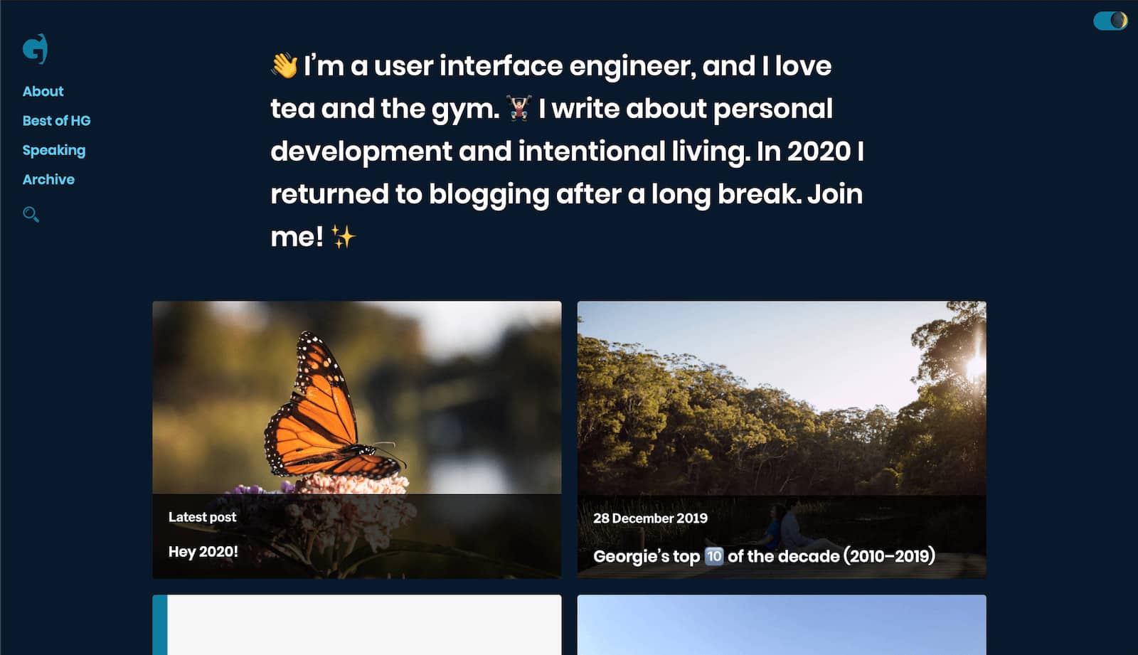
There are several ways to do this, of course, and an internet search will pull up a few. The way I did it may not necessarily be the most performant, since I just wanted to get something out there. I am also of the belief that my blog is a work in progress – that’s not just all the posts I write, but from a technical standpoint too. So it could definitely be improved, not gonna lie. 😄
Adding CSS for dark mode
The easiest way to apply dark mode – and perhaps the most enjoyable, to me, personally – was to have a selector in the CSS, which was applied as a class to either body or html. That selector would determine whether dark mode is on or off, and that would be used to style various elements of the website differently to the default version (which is, of course, light).
I chose to attach the .dark class to the html element because I have set the background colour and colour of text on that element. This is just a snippet of a basic change – essentially the colour of text and the background are reversed from the original.
.dark {
    background-color: #081a2b;
    color: #fefefe;
}

.dark a {
    color: #5bccf1;
}
I had to change the links as well because my branded blue didn’t look good on the darker background. I changed a few other things as well, like other link colours. I was inspired to change the hot pink and the bright purple into pastel shades for dark mode, because it reminded me of a design I created for my blog about nine years ago where the background was a dark charcoal and text colours were reminiscent of pastel chalk on a blackboard. ☺️
There were other bits and pieces I changed but I don’t need to walk through all of that!
Writing JavaScript for the toggle
Since I have an id of html on the HTML element, I’ve targeted it with getElementById. I’ve also used that to target the toggle UI itself (which is technically an input with type="checkbox").
const toggleTheme = document.getElementById('theme-switch');
const currentTheme = localStorage.getItem('theme');

if (currentTheme) {
    document.getElementById('html').classList.add(currentTheme);

    if (document.getElementById('html').classList.contains('dark')) {
        toggleTheme.checked = true;
    }
}

function switchTheme(e) {
    if (e.target.checked) {
        document.getElementById('html').classList.add('dark');
        localStorage.setItem('theme', 'dark');
    }
    else {
        document.getElementById('html').classList.remove('dark');
        localStorage.setItem('theme', 'light');
    }
}

toggleTheme.addEventListener('change', switchTheme, false);
The function attached to the toggle checks if the checkbox is checked – which means dark mode is on. When the checkbox is unchecked – which is the default – dark mode is off. If the checkbox is checked and dark mode is on, it adds the class dark to the html element, and then sets a cookie in local storage so it remembers you’ve turned that on. If you revisit my blog on the same device it will remember that. 😉 (Yes I have a privacy policy.)
Otherwise, if the checkbox is not checked… that dark class gets removed and you will see the default theme. 👏
Styling the toggle switch
The toggle is essentially a checkbox styled to look like a switch. I used CSS from the Codyhouse accessible switch component but adjusted it to my liking. I had originally made it smaller but I found that this affected the tap target on my iPhone, so I thought, well, the bigger the better. 🤷🏻♀️ That was a bit frustrating since I preferred the smaller version.
I will admit that the giant switch looks giant and weird. I also admit that there could be more of a visual cue as to what the switch does. But I also notice that a handful of websites don’t add much of a visual cue, so you’re left “assuming” that the switch is for dark mode, as if it’s become a custom already. Not sure how much I agree with that, though.
I hope you enjoyed this post, something a bit lightly technical but I hope that gave you a bit of insight into how I created dark mode. If you have any suggestions for how to restructure my messy navigation, or notice something I missed fixing in dark mode, let me know!