How I designed our wedding invitations
It’s clearly been at least a year since I created our wedding invitations for our wedding last October, but I had to write this post eventually. I also left it for much later because I didn’t want to reveal any details about the wedding until after it happened. You know, to avoid any unwanted guests or creeps trying to stalk us. 🙂
Why design them ourselves?
I think it was something I wanted to do from the beginning. I’m not a designer by trade, but I’ve got experience and knowledge of good design, and I did do graphic design in the past, so I was confident that I would create some nice invitations. I know there are affordable options to mass print invitations, but something about making them “by hand” made it feel much more personal.
I anticipated getting them sent out six months before the date, so I was hoping to finish them by March 2017. But I had really started on them in February 2017 and the process took longer than usual. At times I was very unmotivated with the design as well. I think most people we were inviting, such as our family, knew the date and had it saved so it was just a matter of sending a formal invitation.
Design
I designed the invitation in Photoshop. I started with a canvas the size of an A5 sheet of paper (which is 148mm × 210mm, or 5.8in × 8.3in). We decided on that size paper because A4 sheets of paper are readily available, and A5 is half that. It would be relatively easy to cut the invitations in half.
When I did the designs I did a really quick mockup and used copy from invitations I found on the internet. I imagined our names in large text and everything else nicely spaced out, with any disclaimer notes at the bottom. I wanted to incorporate our “colour”, periwinkle blue – one of the only things we had set in stone. This colour was the colour of the bridesmaids’ dresses. I used the blue in the “and” or the “&” between Nick’s and my names, and I organised our names, trying out both “Nick” and “Nicholas”.
I remember trying out different typefaces that looked really lovely, but some of them ended up being too much. Too curly, or too feminine. Some of them seemed almost too serious. Some of them were too thick and playful. Some were too rough. I was after a script-like typeface, something close to handwriting but with a bit of flair.
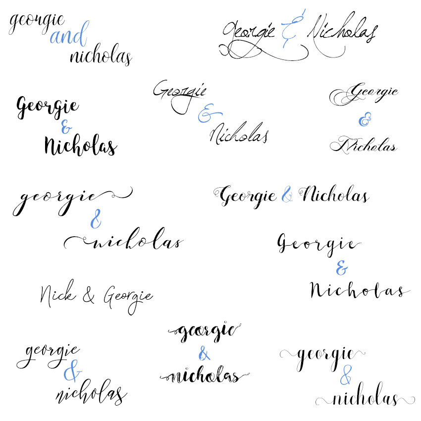
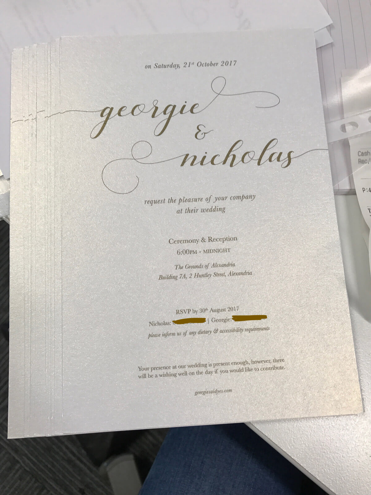
The typeface I ultimately chose for our names, written as “Georgie & Nicholas” in lowercase, was called Silicia Script. I think I got it for free when there was a deal, because I used to be a serial downloader of free fonts/typefaces. But it’s available on Creative Market for $11. I love the glyphs that came with the fonts and allowed me to add decorations on the ends or beginning of letters. There were some options for the glyphs as well, so you had a few to choose from. After doing some research for some inspiration, I decided to try and use the glyphs to make our names bold and extend to the edges. It was a lovely touch.
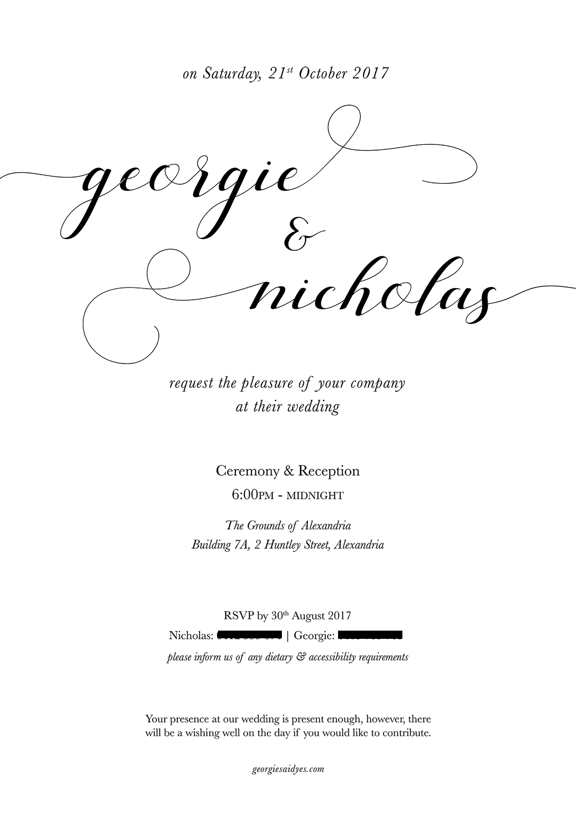
I had the entire invitation in lowercase at some point, but my mum pointed out that it looked a little odd. Trying to be all “stylistic” at this stage, I was hesitant, but I changed it and it looked alright, haha. Especially given that our names were in lowercase.
Materials
I had some craft paper at home that I used to make Christmas cards in years gone by. There wasn’t a lot of it, but it inspired us a little bit and gave us an idea of what kind of paper we wanted to print the invitations on. The paper I had was slightly yellow and had a vintage/aged look.
I went to the art store with Lilian and she helped me pick out some shiny thick paper. It was a pearl colour with a bit of a sheen to it. It was hard finding envelopes to match, and I ended up choosing a dark silver colour. There was one that matched with the envelope but Lilian warned me that people might accidentally tear the invitation along with the envelope, which happened to a friend of hers before. 😛
At this stage we actually didn’t have a huge idea of how the wedding venue would be styled. In my mind I envisaged a very simple invitation. Some of our research showed some very fancy, extravagant invitations, with separate RSVP cards, a map, and other things, such that it was like a little “bundle”. It would have been cute… but the more I thought about it, the more I wondered, who would keep an invitation if we put that much effort into it?
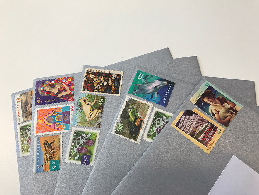
After printing the invitations I had simply used some plain white paper and glue to create labels for the envelopes, at least for the people we were mailing the invitation to. I was short on time to learn how to print sticker labels, or even buy them, so I did it in this DIY fashion. I think I wrote on some of the envelopes too when I was going to hand the invite to someone in person. Clearly, I got lazy, but the invitation itself was the star of the show. 🌟
Printing the invitations
I initially had no idea how we were going to print these, actually. 😳 We hadn’t really thought it through and I thought that I could try to print them at home with the deluxe-looking family printer in Brandon’s room. Unfortunately something about the quality was very off. It gave a bit of a fuzzy look to the text, even though the PSD was in the correct DPI with the correct settings.
I have trust issues. 😰 I somehow couldn’t trust someone else to print it. I wanted it to be me, me, me. Throughout this entire process I didn’t want to enlist the help of anyone, basically. I wanted to dominate the entire project. I didn’t want to send the invitations off to someone to print, even if they would look amazing and wouldn’t cost much. I did ask some people if they knew some printing centres in the city, though, and some of my colleagues gave me some helpful pointers.
I didn’t have to follow through with any of that though, because one of Nick’s printers turned out to be a lifesaver. We ran a few tests on normal paper, and changed a handful of settings, and it turned out that his printer printed the design very clearly. We tested it on some old matte photo paper that I never used, and it came out jet black, just as we expected.
When we first tried printing on the shiny card – the real deal – it didn’t print out black. We had left one of the settings for the printer to be “matte”, from the matte photo paper. When we looked at it, just a bit puzzled, it had this vintage-gold look. Actually, it was really awesome! It had an elegant, vintage sort of look. When we compared it to the jet black on the white photo paper, we envisaged it would look way too bold and have too much contrast. I can’t remember, but I think we may have tried it in black, by changing “matte” to a regular setting, and thought, “…nah”.
It took a couple of tries get it to print well. We had to blow up my design to a criminal amount of pixels to ensure that it was clear. We also had to work with the printer a little bit and do one sheet of card at a time, because any more than that and it jammed the printer. 🙄🖨 We managed, though, to print off a handful, and they were looking good.
Borrowing the guillotine at work
It was basically impossible to cut the invitations perfectly by hand. As we printed two invitations per sheet of A4 card, each sheet had to be cut in half. I chopped the invitations in half at work using the guillotine we have. I hadn’t ever used one but I did see it being used at work before. I was also reminded of teachers in primary school cutting up worksheets using a guillotine. I was intrigued. 😆
It was a tiny bit tricky cutting them in half. Because the design didn’t print though to the edges, there was a bit of gap on the sides. This meant it was possible that the part I wanted to cut was not directly down the middle of the sheet. So even though there was a grid on the guillotine board that marked out where to place the sheet, I had to estimate and shift the card a little bit before I brought the blade down to cut the card.
I got it wrong a couple of times, meaning that when I trimmed the opposite side with the guillotine, I may have had to cut off more than I was supposed to.
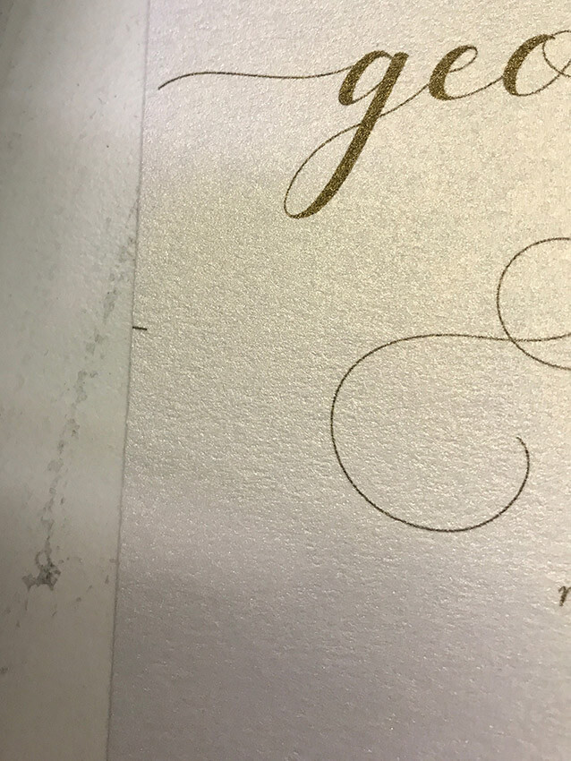
This meant that the resulting invitation would be narrower than expected. Sometimes I missed the mark, and I didn’t quite trim enough. But I couldn’t trim off just a narrow bit of the card, because the guillotine blade was so wide that the part you were cutting had to be a certain minimum width. Otherwise the part you wanted to cut off would just bend over the edge of the guillotine board. This meant I had to cut off a lot more and then trim the opposite side, so not all of the invitations were actually the same width. But people would only receive one invitation so how would they know it was “too narrow”? 🤪
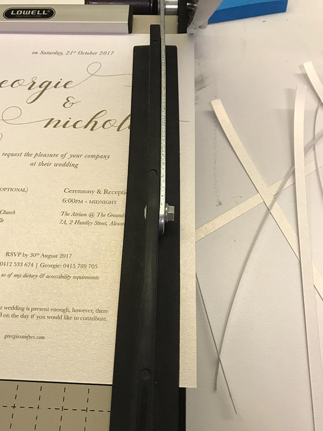
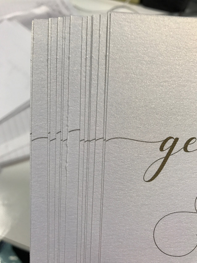
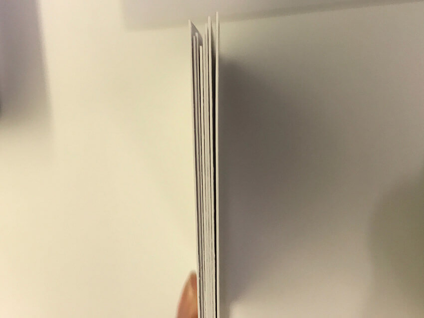
Unfortunately I didn’t take any “nice” photos of the invitations at the time, so these photos are the best I have. We didn’t print any extra for ourselves to keep, haha. But we can still do that in the future if we want. 😉
Some of the problems we ran into
Style of the invitations
I can’t remember how far long we were in the process when we came across this hurdle, but Nick pointed out that the invitations didn’t really match the look we were going for. The venue, The Grounds, had a very rustic sort of feel, and everything should really have matched that way, and that’s what he was looking for in his suit as well. But I’d already bought my dress, and I didn’t want him to know what it was like or see any of the photos as I wanted it to be a surprise, and the descriptions I gave made him concerned that it was too “formal” for the venue. He then became concerned that the invitations looked more formal and didn’t match the overall style.
Copy on the invitations
My mum said that traditionally, invitations would have both parents’ names at the top and it would read that the parents would like to invite the recipient to the wedding of their children. I am not sure if it is traditional or if it’s part of my family’s culture. My mum actually preferred it that way but it was unfamiliar to me, and in my eyes, it would make the design very busy.
Venue confirmations
We had a short church ceremony on the day of our wedding. They kept taking a while to get back to me, and I had to keep calling back to have no response and be prompted to leave a message. I don’t know why but this entire ordeal gave me so much phone call anxiety and unnecessary stress. I won’t go into detail, but basically, I felt like there was such a delay in having my call returned, and the church seemed slightly inexperienced and like they hadn’t done a wedding in a while. I felt that even though I had received confirmation about the venue, I was still reluctant to put the information on the invites for fear that something would go wrong. There are other things that gave me the shits about this process, actually, especially closer to the date. 😩
Anyway, due to experiencing constant phone call anxiety with the situation, I kept putting off calling, too, which in turn delayed me working on the invitations. We actually had two versions of the invitations, one with the church details and the other with just the second ceremony and reception details.
Overall, it went well.
I think overall we spent a little over $100 for all the materials, as well as the postage. The designing was fun, but it was challenging. But I think it was nice to have control over this part of our wedding planning. I know some people use Canva to design their wedding invitations as it’s free and they have some nice designs to help you out. I can’t speak much to that since I’ve never tried the product, though.
Thanks for reading and I hope you enjoyed reading about this! 🤩
Comments on this post
Megan
Sounds like it was difficult but worth the effort! It turned out really lovely!
Jane
How lovely! I love reading posts about how people DIYed their weddings! While I’m just gonna elope, I love looking at all the planning and decor that goes into it. XD
RE: The tradition with parents stuff: I think this is part of something that existed in the “olden days” because parents would marry off their daughters, and parental approval was required regardless of how the daughters felt. And depending on the situation, daughters were technically sold to spouses, with dowries and all. But that tradition, while still a thing here and there, has faded over the years because women started a feminist movement to be seen as individuals so women in the future (today) wouldn’t have to deal with such a thing, i.e. being seen/treated/etc. as property. People who are old-fashioned adhere to the tradition because they tend to cling to their traditions instead of embracing change and being empathetic towards people who appreciate that change. But I understand their resistance towards it, because it wasn’t that long ago that that was still a reality in progressive countries (or whatever the term for this would be).
Amy
Your invitations look amazing, Georgie! I love the font you picked and the paper you used is gorgeous. I bet the guests loved them too!
I’d like to design my own wedding invites, but I’ve not designed anything in so long that I’m not sure how successful it would be. I’ll definitely be attempting it though.
Guillotines are such a pain. At school I had to use them to mount work all the time, and it’s so hard to cut it straight. I used to end up reprinting things over and over just so I could get it to look perfect.
Glad it all worked out and you ended up with such lovely invites!
Rhona
Amazing! I love your invitations! We started the same process of choosing fonts and paper but we ended up buying some from a copyshop. Cute!
Karin
SO pretty! The paper and gold font looks gorgeous! 😍😍😍😍
Reading about the guillotine gave me flashbacks to one of my first jobs where I worked at a print shop… A frequent task was to chop business cards (several printed on one big sheet) with a guillotine. I got pretty good at it over time, but it was extremely scary in the beginning. Even with proper markings it can be difficult to see what you’re doing!
It was brave of you to use it for your wedding invites 😜 But you’re right, it’s unlikely that anyone noticed anything. And small individual differences like that are only part of the handmade charm!
I recently made the invitations for my wedding and had them printed from an online shop. It was easy and cheap to have someone else print them, but I bet your way was much more fun! :D
Jo
Omg, these look great!!! :)
I designed my sister’s wedding invitations and is it sad that I recognise all the fonts that you used, after many, many, many hours to finding a font that my sister liked T_T
I ran into the problem of having to have my parents full names on the invitation as well…with both sets of parents with long Asian names, it did cramp my design style as well. And the printing problem as well! We had so many issues with finding a printer that could print properly on the card stock paper.
$100 AND designing them yourself is a double win I think! It definitely gets stressful with the process but I feel like the designs look absolutely beautiful and you’ve saved on wedding money :)
If you’re interested what the end result of my sister’s invitations was, it looked like this:
https://imgur.com/a/fKzv29E
As I’m planning for my wedding, I’m lucky that my reception has some invitations for us to use and actually look half decent. It’s part of the package, so we thought it was double yay! :D