Review: Paperless Post – design invitations online
Paperless Post is a company that specialises in online stationery and greeting cards. I was given some account credit for the website and was asked to write a review about it. I had never heard of Paperless Post before, so after signing up for an account I took a moment to look around.
The homepage was very welcoming and I noticed that “Flyer” was a new design type that was labelled with “NEW!”. I wasn’t that interested in a flyer and I kept scrolling the homepage.
The style of the “Classic invitations” banner enticed me the most because of the classy style of the invitation it was showing, and the fact that it was inspired by nature. It reminded me of some of the inspiration I looked at for when I designed my own wedding invitations. I clicked through because the other types of designs were not really interesting to me (kids birthday parties and baby showers).
I landed on a page that prompted me to choose from many different types of invitations. These actually happened to include the kids’ birthday and baby shower invitations so I got to catch a glimpse of some of the designs even though that’s not what I was after. They looked really cute! I browsed through and found a wide range of designs to suit different styles and occasions. I was already impressed with the variety and I noticed there were a lot of designs to go through. The default listing is by most popular design, so out of curiosity, I skipped to the end. I found that the designs towards the end weren’t to my liking.
I didn’t have anything in mind that I wanted to create. Unfortunately both Nick and my mum’s birthdays were last week, as well as my friend Pauline’s, so I took inspiration from the website and decided to create an invitation for a made-up cocktail/drinks party, since I liked some of the existing designs. 🥂
I spotted some really nice ones and some really classy ones, but I was looking for a colour scheme that was fun, but where the font/typeface wasn’t too fun. So a mixture of fun and classy. I was able to preview the invitations before selecting one, and I settled on this one:
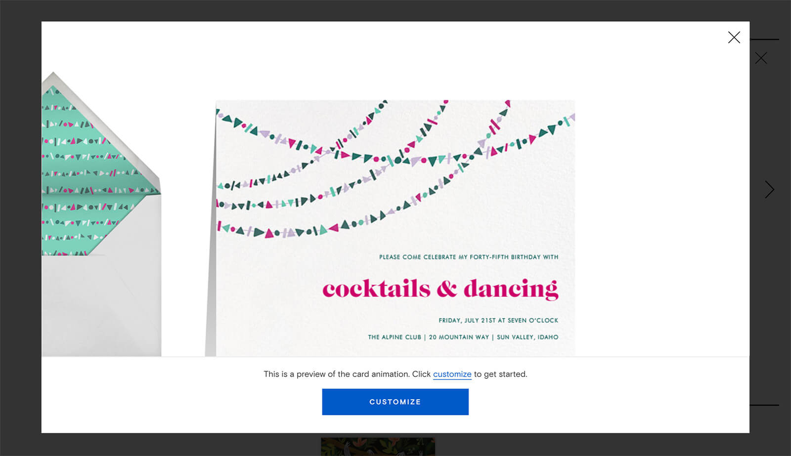
I was pleasantly surprised to learn that I could then choose a backdrop, which meant I could further personalise the experience.
I could also modify some of the colours on the design, as there were some variations. The original streamer decorations on my card had a mixture of deep and bright colours, but I chose the one with brighter colours.
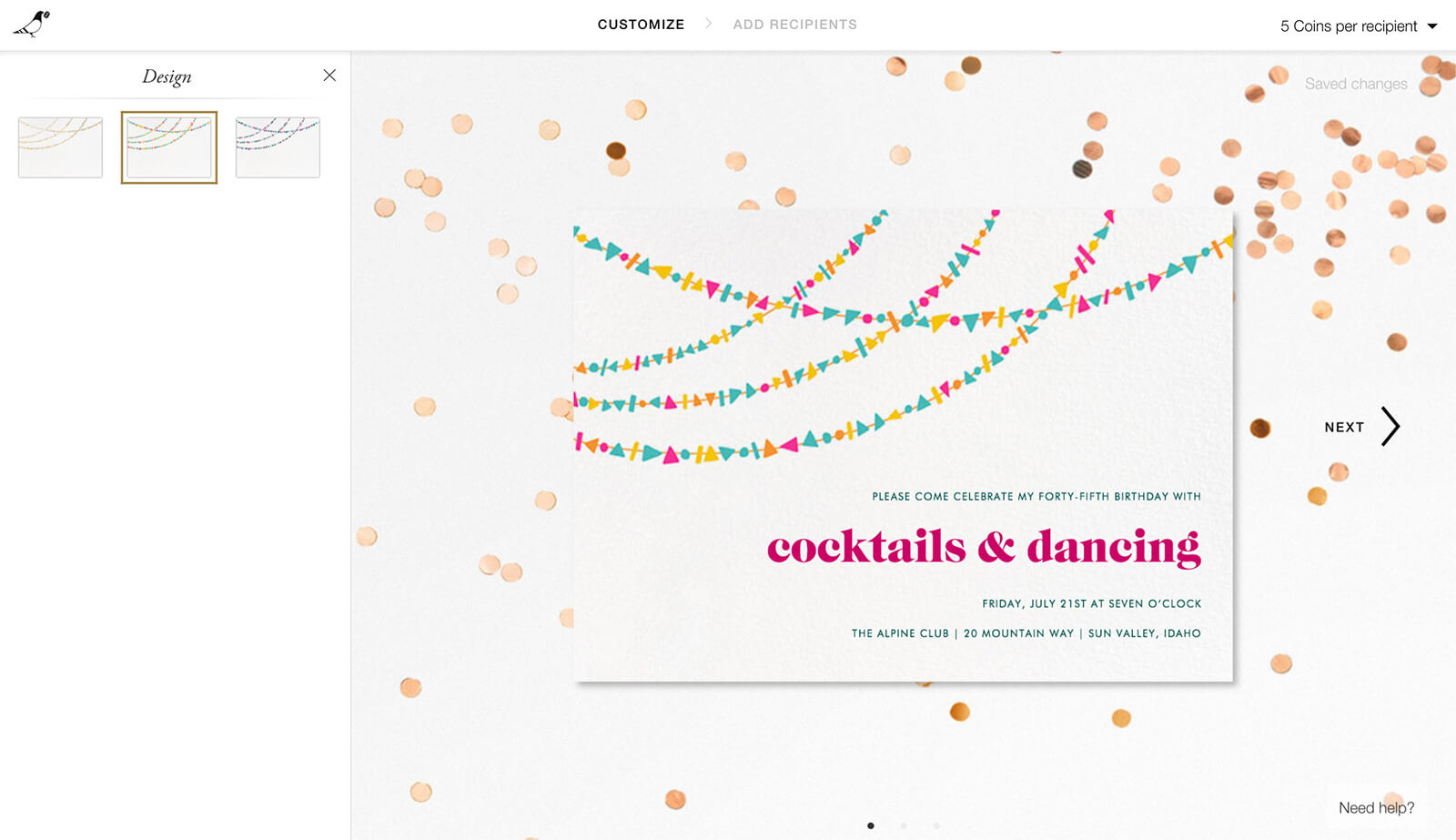
For old times’ sake, I put the address of The Dip, a now-closed hot dog bar that I had my twenty-third birthday at. 🌭 There’s definitely some other eatery there now, but I haven’t been there in at least eighteen months, and The Dip closed a couple of years ago.
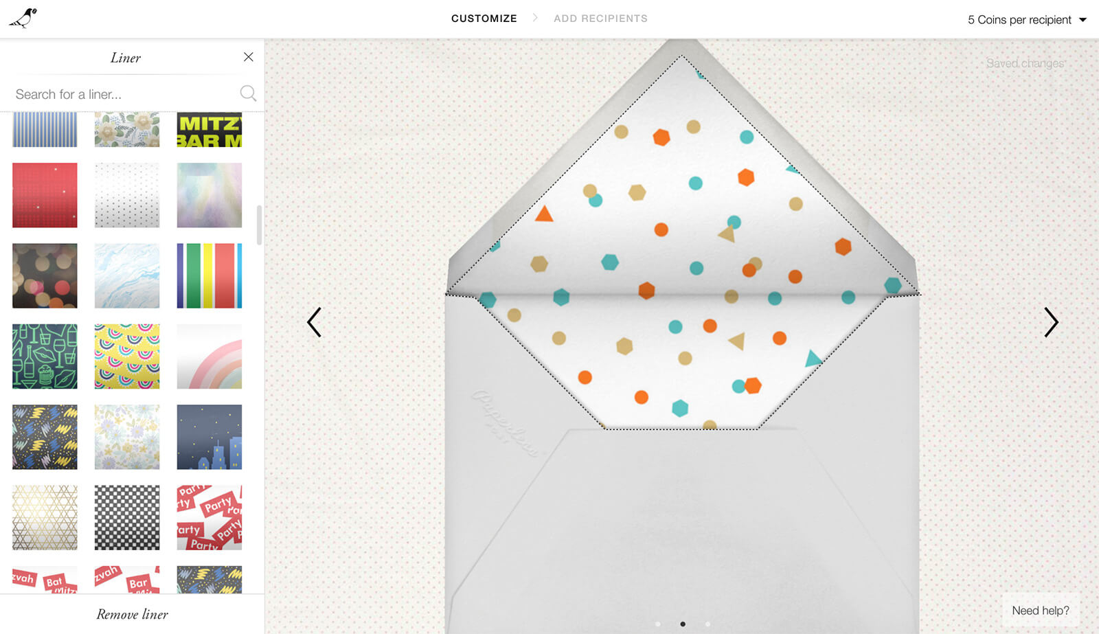
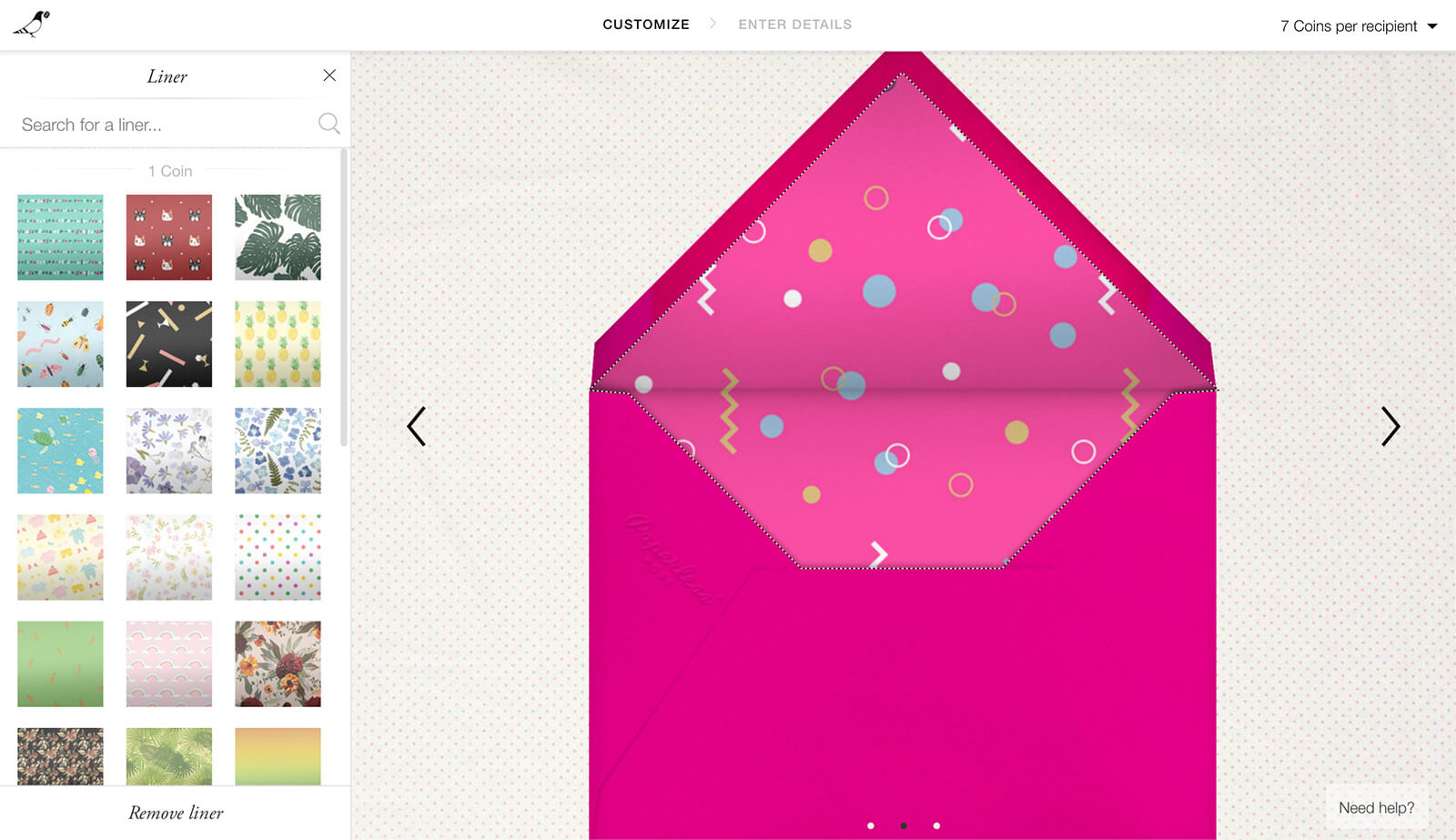
I actually had a lot of fun playing with the envelope design! You can choose the liner colour and the envelope colour. To be honest, I really loved some of the patterns for the liner. It actually reminded me that some envelopes have liners – this is a really nice touch. I am accustomed to more fancy and expensive greeting cards/envelopes having patterned envelope liners in real life. So the fact that I could edit this digital one was a lot of fun.
You can preview the experience accordingly as well, so when I chose a mostly-white envelope I found that it didn’t work so well with the colour of the invitation when the animation played. So I made the envelope and liner hot pink to match one of the colours on the design. 😄 Sadly, although you could choose a custom stamp, there weren’t many, and the postmarks were mostly United States related and there wasn’t an Australian one. There was a London and Canada one though. 🙂
You can send yourself a preview of the invitation, to check if everything looks fine before sending the invitations for real. I was pretty happy with the fact that you could send yourself a test. To me this is particularly important as you don’t want to realise you’ve make a mistake after the invitations/emails have already been sent!
Now it turns out that along with organising RSVPs, you can actually make an event page and show your guest list on that event page, as well as a map. I was very impressed – Paperless Post doesn’t make this obvious from the get-go, so you’ve basically got the entire old-fashioned invitation-sending and event-organising process translated to digital format, to a T!
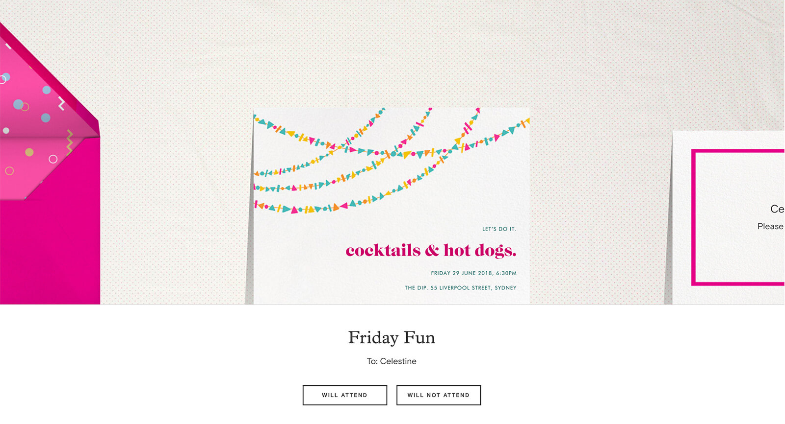
I was pretty impressed with my experience trying out Paperless Post. I had fun making an invitation for a made-up party, I can imagine I would have fun if I was creating something for a real event or sending someone a greeting card. The features of sending an invitation were quite extensive (the event page, the fact that you could send invitations in a very organised manner). Although I haven’t yet tried out the other design types, I get the feeling it will also be a positive experience to create a greeting card or the new flyer that the site is promoting.
In terms of cost, you do have to buy Paperless post “coins” to create more fancy designs and use some premium options. It also costs a certain amount to send your design. One invitation cost me 7 coins to send. I was supplied with credit in return for this review, but if I bought coins, 20 would cost me $16 (Australian dollars), and there are many other tiers, with 1000 costing me $130. One coin basically costs you less than a dollar so you’re paying a few dollars to use the site and its services.
If you embrace digital creativity and have an event coming up, I think Paperless Post would be worth a try. On their About page, they state:
Our users are our customers. Because they pay us for a product they love, we’ve never had to answer to ad sponsors or third parties.
I found that this struck me by surprise because I wasn’t expecting that the company didn’t have to answer to ad sponsors. It makes sense though – the website is beautifully designed. And you do pay to use the product, which I have to admit was a pleasure to use. There were a couple of times the user interface failed to update while I was selecting design options, but usually a refresh fixed it.
Disclaimer: I was provided with a significant amount of Paperless Post credit to use the website in return for this review and a link to the website.
Comments on this post
Jane
Ah, your review.~ It looks like it was made by an adult instead of a kid trapped in an adult’s body. XD
But why am I the first person who commented this? #SummerSlackers, tch.
I looked around their website a bit after and was impressed by their company ethics. They also showed pics of, like, their office (I mean, I surmise it was) instead of showing stock photos that feature models in uptight clothes, perfect faces and American Dream bodies, and the one woman front-and-center. I like the small businessy feel a lot. :)