This is a backdated April Fools post
In its ruggedness and lack of concern to look comfortable or easy, Brutalism can be seen as a reaction by a younger generation to the lightness, optimism, and frivolity of today’s webdesign. —BrutalistWebsites.com
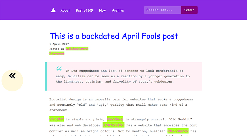
Brutalist design is an umbrella term for websites that evoke a ruggedness and seemingly “old” and “ugly” quality that still makes some kind of a statement.
Craigslist is simple and plain; Bloomberg is strangely unusual. “Old Reddit” was also and web developer Jenn Schiffer has a website that embraces the font Courier as well as bright colours. Not to mention, musician Alex Cameron has a huge stretched photograph of his face as the background of his website.
Websites these days are bloated due to many scripts, imported fonts and other resources that generate a slick, “minimalist” website. Yet performance is a common issue, and a look of “minimalism” takes ten times as long to actually produce. Motherfucking Website is a website that boasts a lightweight design, default Times New Roman font, default blue links – wait, actually, there is no CSS at all – and it’s mobile friendly (surprise, surprise), accessible, and compatible in all browsers.
Brutalism is seemingly a statement against all over-designed websites, and a reminder that more is not always better. An article on boingboing.net puts brutalism quite well:
Brutalism didn’t look like something from 20 years ago until it was 20 years old.
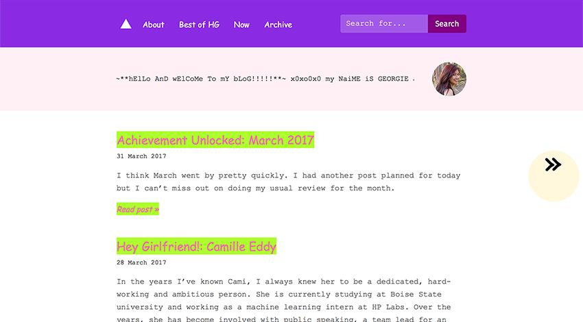
With that, this current theme on my blog was intended as a huge joke for April Fools, and I left no sign on it that it was a joke. Nick said to me, “It actually doesn’t look that bad. I mean this font is Comic Sans but this [the footer] looks OK”. When I was looking at it, I actually admired the playful typefaces and the pink and green contrasted really amusingly. I dislike pink, but it works well. And when you hover over the links, I mean, they’re accessible – if you were vision impaired, at least you are able to see the border around the link so you would know exactly where you are clicking.
A couple of people fell for the joke, they liked the colours and the new look. I think that above all, given my OK skills as a part-web-designer, I wonder if some people respect my work so much that even if I designed something deliberately “ugly” it would be considered great. I’m not one to toot my own horn, but I kinda think that although I designed something with such recklessness, it still looks pretty good.
As for whether you can take me seriously because I’ve used a font like Comic Sans, well… 😂 Enjoy the design while it’s up; the regular aqua colour will be back in a day or so.
If you want to see more brutalist websites, have a look at BrutalistWebsites.com.