Ligatures, and how you may not really be seeing strange typos
Preface
While working on Liz’s blog theme a couple of months ago, I couldn’t help but notice what looked like a lot of typos. The word “life” appeared as “lfie” and “if” appeared as “fi” multiple times. Liz was struggling with limited internet access on her mobile phone at the time, so we both concluded that it must just be the autocorrect on her phone doing something weird…
What is a ligature?
A ligature, according to Fonts.com, binds two or more characters into one – coming from the Latin words ligatura, and the verb ligare, meaning “bind” or “tie”.
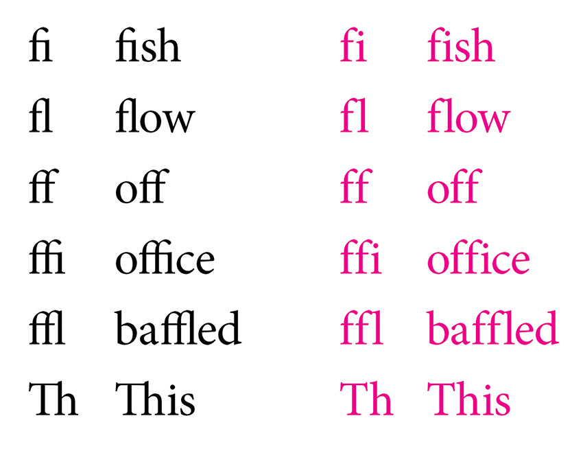
Common ligatures bind the letters “f” and “i”, “f” and “l”, or “f” and “f”. Here is an example showing ligatures in several different words, compared to the words without using ligatures. You can see that some of these letters are closer in proximity.
The author of one particular StackOverflow question explained it well, too:
Modern browsers automatically combine some letters, most commonly ‘f’ and ‘i’ to one single character called a ligature. This often optimizes legibility (i.e. easier to read), however sometimes this might not be what a designer wants.
There are also some rather fancy ligatures, but I won’t go into detail here. The Fonts.com article has more information, and also suggests not using ligatures for large headings and to use them with careful consideration on the web.
Investigating the issue
I read Liz’s blog regularly, so noticing all these odd typos was driving me mad. But I knew that Liz proofreads her work and is meticulous about errors, so I didn’t think it could possibly be her making the mistakes (or, her phone). She also said she looked for the typos I mentioned but could not find them at all.
At first, I didn’t think to check another browser, because I’m a terribly brutal and avid Safari user. But I should have done that almost immediately! It turns out this strange ligature bug was only occurring in Safari. It took me a while to even think of inspecting the copy on the page and compare it to the actual source code to realise there was a problem.
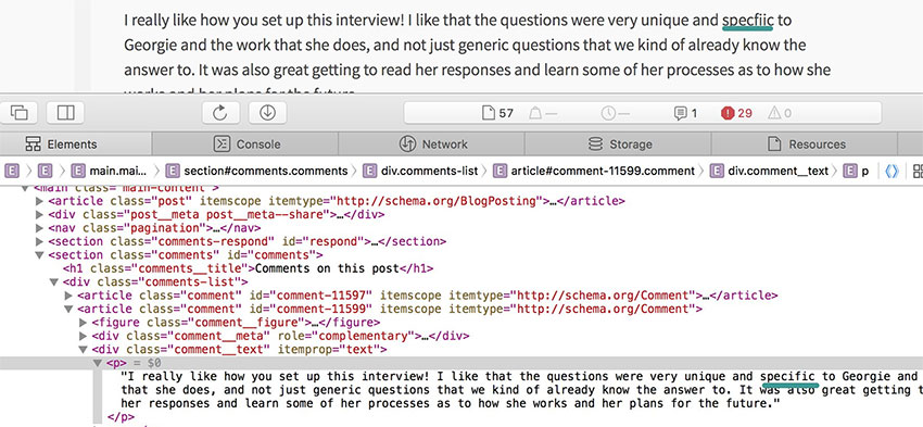
The screenshot above shows one of the words I saw. The text on the page did not match the source code – so Liz was definitely not making these typos! (By the way, this screenshot is on Liz’s interview post where she interviewed me. 😎)
I had noticed that it was always the letter “f” and the letter “i” that were jumbled or swapped around throughout Liz’s blog posts, and using just this information, I searched for a solution.
Searching for a solution
I searched the internet to see if anyone had the same issue, but at first nothing came up. I couldn’t really explain the problem and I had not yet considered that the issue was browser-specific. But once I narrowed that down, I found a StackExchange question where someone was having the problem with the Google font Merriweather Sans. Thankfully they had specifically included the “if/fi” jumble as an example. It looked exactly like my problem, was specific (or if I were to make a terrible joke, “specfiic”) to Safari, and I was also using a Google font for Liz’s theme.
One of the answers led to a GitHub issue for the Google Fonts repository that reported this very issue recently. The issue is closed and fixed now, but at the time I looked, it was still open. Dave Crossland, who works on Google fonts, provided a workaround by turning off ligatures in CSS.
-webkit-font-variant-ligatures: none;
font-variant-ligatures: none;
-webkit-font-feature-settings: 'liga' 0, 'onum' 1, 'kern' 1;
font-feature-settings: 'liga' 0, 'onum' 1, 'kern' 1;
I applied the above code to the entire document (the html selector), and that fixed the problem. (Since I skimmed the comments on the issue, I actually missed it at first!)
It took a bit of time but I’m glad I figured it out. ☺️ Safari is not the world’s most popular browser, and the majority of users on Liz’s blog may not even use Safari, but I do. I take pride in my work and I couldn’t let the problem go unnoticed. Even though it was due to the font having an bug, I’m glad it was a relatively easy fix. If you don’t like how ligatures look on your website, either, you can always turn them off this way.
Liz’s theme has been online for quite some time, but have a look if you haven’t already. It’s my latest work and I’m definitely very proud of it, and glad Liz likes it too. ✌️