How to make presentations & talks more accessible and inclusive
I recently spoke at Laracon AU about how to make your website more accessible, even if you don’t have much of a background in design, and I was inspired to write this blog post about how to make presentations and talks more accessible. Giving some talks in the accessibility space has opened my eyes even further to how we can make events more accessible to everyone, beyond simply making the space physically accessible and comfortable.
I’ve been passionate about accessibility since I learned about ARIA roles and semantic HTML early in my development career in 2011. Bringing meaning to code really brought my love for words, vocabulary, documentation, and code together. And I knew that I could help make things better and make folks in minority groups feel included. One of my earliest talks was at A11y Bytes Sydney in 2016, and prior to the event, the organisers provided a few tips on how to make my talk accessible to everyone.
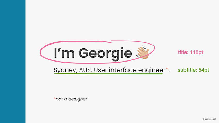
They were some pretty simple tips, nothing too detailed – but it really made me think about how inaccessible my presentation slides were at the time. I had been using a bright, aqua colour for the backgrounds on my slides. The text on the slides was white. I could read it, but I realised that with my 20/20 vision, I was extremely privileged, and the colour combination did not have enough contrast for people who might be visually impaired. I was also reminded that I should speak about the visuals on my slides, and not rely on the audience being able to interpret the visuals immediately, or at all.
Both these things, though small and easy to fix, made me infinitely more aware of flaws in talks and presentations, and how we can make presentations accessible to all. I decided to put this article together so that you can consider them next time you are working on a talk or presentation. Most of these pointers are for presenters and speakers to consider, but if you organise events, these might be handy if you want to place restrictions or guidelines for your conference.
Improve the visual presentation of your slides
We love to make our slides pretty. But a general rule is to keep your slides relatively simple and clean.
Make your font size as large as possible. You never know how far away some people may be sitting from the screen, and you might not know how big the venue is. A font size of 60 pixels can look average from the back of a theatre, and it’s not unusual for slides to contain text with font sizes of around 100 pixels.

Increase colour contrast as well – using black text on an almost-white background is a safe amount of colour contrast and can be accessible to pretty much everyone. Consider that having the reverse – white text on a dark background – can be difficult to see if sunlight makes its way into the room and washes out the projector, or if the projector’s maximum setting is not bright enough.
Relying on colour alone can be risky, because there can be issues like glare, stage lighting, brightness of the projector screen washing out the colours you use, and so on. If you love colour so much and you need to use it somewhere, use it as an accent as a border on your slides, or a single top border, or as a way to highlight text. If you need to provide some kind of key or legend for diagrams, make use of different shapes, or thickness of borders.
Carefully consider your choice of typeface. A simple sans serif typeface with large font size and enough contrast is going to be more readable than a fancy typeface at the same font size and colour contrast, and is more dyslexia-friendly. To further improve this experience, avoid too much change in bold, italic, and underlined styles, and avoid large amounts of text in uppercase.
Use universal examples and language
Keep in mind that slang and colloquialisms may not be universally understood. Consider that you might have some visitors in your audience, even if you are speaking in a certain country and want to use some of the country’s cultural references.
Be careful with the language you use. Although you may have no intention to offend, words like “crazy” and “retarded” are ableist (Autistic Hoya has a list of more terms to avoid and what to consider instead). Greeting an audience with “hey guys” is not inclusive of mixed-gendered groups. Use “everyone” or “folks” instead.
Use universal examples when explaining points in your talk. Something that everyone can relate to and may have experienced at some point in their lives is more inclusive than a pop culture reference for, I don’t know – something like John Wick. (It’s a movie I’ve watched, but the fact that it’s so violent – albeit comically violent – triggered feelings of anxiety for me. So I don’t enjoy any reference or conversation about it. And I doubt “everyone” is going to enjoy or understand a reference to something like that.)
Be mindful when including jokes.
I’ve seen many a talk where the presenter includes a joke. Jokes can be offensive and not-funny, depending on the angle you present them. They are also likely to be culturally dependent. Be very mindful of the Code of Conduct for the event you are speaking at and that any jokes do not put you at risk for breaching the Code of Conduct.
Also consider the demographic of the audience, particularly if you are speaking in a country outside of your home country. Some jokes may be funny to an audience from your home country, but may not translate well if you deliver the talk elsewhere.
My recommendation: try to use universal examples in your talk, and don’t centre talk content around a story that might only make sense in a particular region. This is particularly important if your talk will be recorded and posted online, where you might receive viewers from around the world. It also saves you some time and work in updating the talk if you need to deliver it elsewhere.

Explain memes. Or reconsider if you should use them.
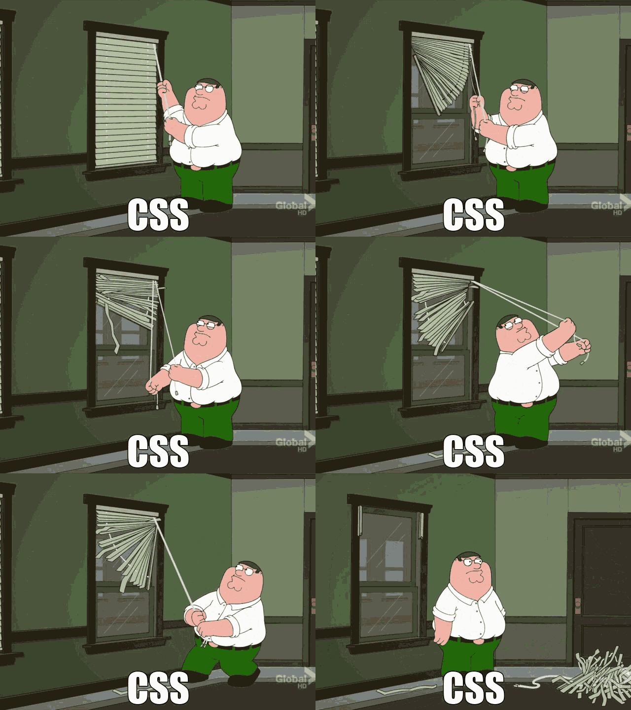
Memes are often visually presented on slides, yet not often verbally read out or explained. It’s important to remember that memes are a part of pop culture, and not everyone is exposed to this for various reasons, even by choice. A typical situation is that the presenter pauses speaking and shows the slide with the meme, and it’s a cue for the audience to take in what they see, resulting in laughter.
But not everyone can visually see the meme, or understand the meme. Explaining the meme and its position in pop culture is actually educational for anyone in your audience who might not know about it. Think about it – it’s possible that some audience members might see a similar meme in other talks, and they’ll appreciate you for being the speaker to have introduced it to them!

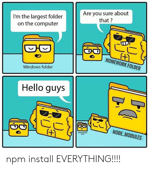
alt and longdesc 😌) (Source: me.me)I’ll give you an example of a meme I didn’t know about. I didn’t understand the “Guy Fieri in your node.js packages” meme until I spent some time looking it up and reading about it. Before explaining this meme, you need to know that Guy Fieri is an American television personality mocked for his spiky bleached hair and mannerisms. The explanation is that a lot of people install third-party dependencies for their projects without really looking at or knowing about their contents, and someone wrote a satirical article about how a photo of Guy Fieri is in everyone’s third-party packages.
Having to explain a meme is thought to “ruin the joke”, but I don’t think this is necessarily the case.
Or perhaps it illustrates the fact that memes are inaccessible jokes.
(To be clear, I did not link to the satirical article about Guy Fieri being in your node.js packages, because, personally, I didn’t find it funny. Not because I had to figure it out – but because I literally know nothing about Guy. It was a cultural reference I didn’t understand. I’m Australian, by the way – and I don’t watch any free-to-air television.)
By not explaining a meme, you’re making an assumption about the audience. Reading out text on a meme, or explaining what is visually shown, is considerate of everyone. It might even be a situational consideration, such as someone looking down for a split second to take notes, only to miss reading what’s on the slide.
Don’t pollute your slides with too much text
One to two sentences is enough for a slide. A small list of digestible bullet points is enough for a slide. When presenting a talk, it’s – well – a talk. The slides serve as a visual aid. If your audience wanted to read more text than two sentences, they would read a short article. If they wanted to read more than a short article, they would be happy to read a longer article. People with dyslexia can potentially have a lot of trouble reading a busy slide with a large block of text.
Although we try to multi-task with routine low-effort tasks, or habits, like listening to a podcast and doing the dishes, exercising and listening to music, or eating and watching television – the more effort required by our brain for either task means that there is an increased risk of doing either of these tasks improperly. We cannot read something and listen at the same time and consume both mediums effectively, even if the two might be related.
Remember too, that the slides are for your audience, not you. They are a visual aid to help keep your audience engaged and listening to you. If you need speaker notes, use them on your second screen, a phone, pieces of paper, palm cards – whatever works for you. Don’t use the slides as your notes.
Add captions on your slides for visuals
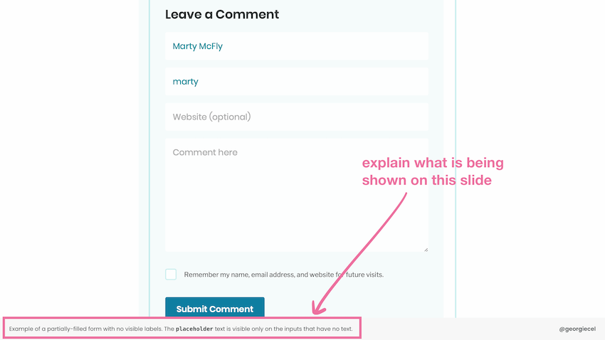
When you have a photo, image, diagram, or some kind of visual on your slides, it’s a good idea to give it a title or caption it somewhere. This can be useful for your audience both during your talk and post-talk. They may refer back to your slides but not remember the point you were making, so a caption can help jog their memory.

If your talk is posted online, or someone is referring to your slides without listening to your talk, the captions can be useful for them to get the gist of what you were talking about.
Remember: don’t pollute your slides with text. That’s not what I mean when I say “caption”. Use a short caption (one sentence), but don’t supply a full explanation of the visuals in textual form directly onto your slide. If someone is looking only at your slides post-talk, and they want to read more, they will be happy to read an article.
This leads into my next point below.
Provide a transcript or an article version of your talk, if you can
Depending on how you wrote or structured your talk, you might have an article already, or you might plan to write one. This can be really useful for anyone who wants to know about your talk but struggles to view videos or listen to audio.
Some people are hard of hearing, and a recording of your talk may still be difficult for them to process. I’ve personally spent time writing transcripts of some of my talks that were recorded. If writing a transcript is too much work, or you have memorised your entire talk, making your speaker notes available can be useful. You can make this task easier for yourself by arranging the notes in a nice manner beforehand, so that you don’t need to spend “extra time” writing notes or a transcript after your talk.
I’ve also noticed some YouTube channels add captioning directly on videos in the editing process, particularly when the video contains people from non-English-speaking backgrounds, even if the people are actually speaking in English. If you can spare the effort, applying captions to your videos (as well as visuals on your slides) is really considerate.
Speak slowly and clearly and enunciate your words
Regardless of what language you are speaking in, speak slowly, and clearly. It can be difficult for audience members to listen and take in what you’re saying if you are speaking too fast. Small groups of words can be hard to discern if they are spoken too quickly. The language you are speaking in may also not be the mother tongue of some of your audience members, so they may need extra time to understand what you are saying.
If you are speaking at an event that will be live-captioned, there is someone there working hard to caption your entire talk as you speak. Although this is their job, you can make it easier for them.
In the event that a video of your talk is uploaded online or recorded digitally, subtitles may be automatically generated. You can help make them more accurate by speaking clearly.
Provide content/trigger warnings or avoid sensitive content
It may depend on your topic and audience, but avoid sensitive content that can affect your audience members. This includes graphic imagery such as blood, gore, medical procedures, and violence, but can also include mere mentions of topics such as: suicide and death, self-harm, medical conditions or medical practices (including but not limited to eating disorders, cancer, depression, anxiety, schizophrenia, surgery, biopsies, blood tests or bloodwork), grieving, animal cruelty, political debate, terrorism, war, violence, and harassment (including but not limited to racism, sexism, and LGBTQIA+ violence). These topics are best avoided so as not to upset or trigger members of the audience, but if you must speak about them, do one or all of the following:
- notify the organisers of the conference so that they can include this in their program
- mention this at the very beginning of your talk
- provide another warning right before you introduce the topic
In recent years I’ve seen speakers and organisers become more considerate of sensitive content, namely XOXO festival for including content warnings in their program, and most recently my colleague Ryan provided adequate content warnings for a talk he gave at our workplace’s internal speaking program, Bread Talks. It doesn’t matter how big or small your audience is. Be considerate of how your talk can affect them.
Read more about content warnings and trigger warnings for inclusivity.
Do not joke about content warnings.
You may think it’s funny to joke and warn people about your talk containing mentions of certain groups of people who are interested in, engage in, or are a fan of a certain way of doing things, or a certain style of exercise, or a certain programming language, or a certain operating system. You are entitled to your opinions about these things, and you are allowed to voice them politely, but warning about your talk being against a certain group of people is:
- excluding and offending that group
- a sign that your talk isn’t going to be a good one if you’re going to take that kind of standpoint.
Be very careful when joking about a group of people taking a certain approach – for example, a certain approach to building software. If you disagree with the approach, don’t joke about it and make people in this group feel excluded. Explain why you disagree, or make yourself open to communicating and discussing after your talk.
Consider your talk length
Having recently spoken at Laracon, I now see the full benefits of having every session a strict 30 minutes maximum. It allowed for more relaxed breaks between blocks of talks, and it was easy to focus on two to three talks in a row. Longer talks can affect people with physical impairments or medical conditions that does not permit them to sit for long periods without movement. It can also be tough for people with learning disabilities or mental impairments to focus on a presentation for a long period of time.
It was also less work for the speakers to prepare. Speakers didn’t need to worry too much about keeping to time, or trying to fill up the space, either – because it turns out 30 minutes is a comfortable median. While the onus usually isn’t on the speaker to choose the length of a session, this is something conference organisers could keep in mind. 😊
Making your talks and presentations more accessible might take a lot more work compared to what you’re already doing, but you don’t have to apply all of these suggestions immediately. You can apply these considerations in your own time, and make gradual change.
Even if you don’t think that someone needs to be catered for, respect that your audience has needs. If you found this article useful, please share it. 🤗 Thank you for reading!
Comments on this post
Megan
Interesting read! I guess a lot more then you think goes into stuff like this! I wouldn’t of thought of all that.
Shanae
Hi Georgie,
It’s been a long time since I’ve been able to swing by your blog. This was definitely a good post to have been up for the first visit in many months. You point out many things I personally have never considered in presentation slides, especially about audience language. Of course, we all know to use careful wording choice, but you brought up ensuring you use generic classification in terms of audience. I have been guilty at being far too casual in the introduction, as Im sure many have.
I also like how you touch on content warning. In the society we live in it is far too easy to accidentally offend someone, therefore it almost seems content warning should be an inevitable part of any even semi-casual presentation. The same goes for anything that may trigger mixed feelings, as mental illness is ever prevalent and sometimes a seemingly harmless turn of phrase may hurt another.
All in all, I really found this post informative, yet interesting to read. Awesome job as always :)
Best,
Shanae