Update to post header styling
Back at my old workplace, one of my fellow engineers liked to tell people how great my commit messages were in Git. He was the kind to write “wip” (“work in progress”) before squashing all his commits. Every incremental, valuable change, for me, would be a separate commit.
I almost feel like the title of this post reads like a commit message. I tend to write fairly descriptive commit messages. I also wrote extensive and detailed diff summaries – something my fellow front-end developers would applaud, too.
This is just a post to outline the update I made to my blog layout recently, which only looks like a small change, but does encompass a bit extra in terms of updating some microdata and cleaning up some HTML.
Before/After
Previous appearance:
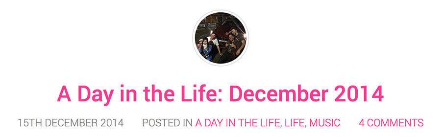
Current appearance:

I think the previous version had an even larger thumbnail at some point last year, but after realising that this didn’t look too crash-hot on retina MacBook Pros (like mine, hah), I reduced it to half its size.
Summary of changes
Here is a summary of the visual changes:
- Removed the light grey border from the thumbnail. I decided that it wasn’t necessary for an image so small.
- Adjusted the font size of the post title to be smaller.
- Changed the metadata to normal sentence case. Uppercase was probably hard to read.
- Changed the font of the metadata. Just wanted to add a bit of interest, and this font has a slightly heavier weight so may be easier to read.
- Aligned the text to the left, along with the thumbnail image. This saves vertical space, and left-aligned text is a little easier to read when there is a lot of it. I didn’t test this until just now, but if the title is extremely long, it does run on nicely to the next line without any issues. The view on tablet size is still centred. I may or may not change this – I have had a lot of compliments on the tablet view.
- Used a
·separator for the pieces of metadata. I didn’t want to use icons because I wanted to keep this as simple as possible without ‘noise’ and without any extra resources. - If there is no thumbnail, it will look like this post – the text will simply be aligned to the left. No space is reserved for the thumbnail.
Overall I saved a bit of vertical space and made the area more readable. If you have any suggestions for further improvements, let me know. I know the image captions could do with some work because as you can see from this post, images with white backgrounds look a bit odd with the caption sort of ‘floating’ underneath.